Featured From the Archives: What’s in a Name?

My muse failed me this week. Like straight-up turned tail and ran, laughing maniacally as she went. So I apologize for once more having to cull something interesting from the archives. I promise, there will be new material next week. Even if I have to drag my muse, kicking and screaming, from her beach sanctuary and duct tape her skinny butt to the chair. It will happen.  In the meantime, here’s a snarky look at every writer’s favorite task — naming things. Enjoy!
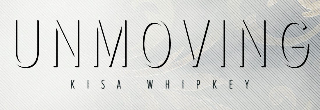
What’s in a Name?

By Kisa Whipkey

(Originally Posted on 6/29/12)


Maybe I’m part Fey, or maybe I’m Rumpelstiltskin’s great-granddaughter, but I believe names are extremely important. Probably because I’ve been graced with a somewhat unusual name myself. Wait, did I say graced? I meant cursed. Doomed to endure countless mutilations, including: “Keisha,” “Kissah,” “Kye-sha”, and my favorite, just plain old “Lisa,” because obviously that “K” has to be a typo. There was even an unfortunate incident where, after explaining the spelling of my name as “Lisa, with a K,” the person responded with, “okay, Ms. Withakay, will there be anything else?” Seriously! No joke. So now, I actually do give my name as “Lisa” at fast food places, or anywhere they’ll be calling it out randomly, because it’s just easier. As long as I remember I’m answering to that. And who knows, Lisa Withakay might just make an excellent pen-name someday. Everyone needs a good alias, right?

For the record, my name is pronounced “Key-saw.” Difficult, isn’t it? But I respond to pretty much any variation thereof, as evidenced above. I think I already mentioned that it’s Russian for kitten, didn’t I? Well, it is, as confirmed by several people I’ve met who actually speak Russian. And no, I’m not Russian, nor is anyone in my family tree that I’m aware of. German, English, a little Scottish, yes. Russian? Sadly, no.

So how did I end up with this charming, pain-in-my-ass name?  Let’s just say this is what happens when soon-to-be parents stumble on those lovely little baby-name books in the bookstore. And trust me, after seeing the other options my parents had circled, I ended up with the best one. As much as it has irritated me over the years.

Anyway, back to the topic at hand — names.

Finding a title for a work can be the hardest part, whether it be a novel, a masterpiece of art, or a choreographed routine. It’s one of the first impressions your audience will get, so it has to accomplish a lot of things: summarize the plot, theme, and overall tone; provide something catchy that will make your work stand out among the masses; create a lasting impression that’s easily remembered; and build a sense of mystery and intrigue about your work’s content. All in just a few short words. No wonder many people find the process of naming a daunting task.

For me, this is a critical part of the creative process, and often, I have a title before I have anything else. Naming something is my favorite part. It’s the moment when whatever I’m working on becomes a thing of substance, its existence clicking into place like the final piece of a puzzle. It’s no longer just a vague concept floating around in my head — it’s a declaration of identity. And I rarely change a title once I’ve found it, whether it’s on a story, an image, or a character.

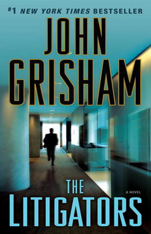
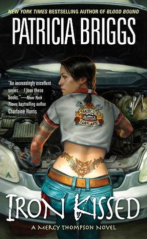
Others aren’t so lucky, struggling under the burden of working titles or simply leaving something as “Untitled.” And still others completely miss the mark, dubbing their spectacular work with a lame, uninspired title that dooms it to obscurity forever. They say you shouldn’t judge a book (or artwork, or choreography, etc) by its cover, but the truth is, everyone does. And the title is as crucial to your work’s success as the rest of the packaging. How often have you picked a book off the shelf solely for its title and cover art? Or browsed Itunes and found new artists because their album covers looked cool? Or rented a movie because it had an interesting name? And how often have you done the opposite? Scoffing at something because of a lame title, stupid cover, or lackluster blurb? I think you see my point.

So, what’s in a name? Everything!

Which is why you should spend as long as it takes to create the perfect title for your piece, whatever it may be. I’m afraid there aren’t any sure-fire techniques I can share for how best to choose a title, though. I’m sure there are others out there who would gladly try to tell you the correctness of their own process, but I believe creativity is too personal for that, and every artist, dancer, martial artist, writer, musician, has to find their own way of doing things. What I can offer you is a succinct version of how I go about it.

I remember reading somewhere, (and I apologize that I don’t have a direct quote for you), during my research of Disney’s story process, that they try to sum up each film’s plot in a single sentence. Being the complete fangirl I was back then, I thought that was a brilliant idea and adopted it for myself. It’s actually a lot harder than it seems to boil a complicated premise down to a simple sentence, but eventually, you get good at it. How does this pertain to titles? Well, once you can summarize your work with a single phrase (and this generally works best for writing, although it can apply to the concepts of art and choreography too), you can take it one step further and chop it down to only a few words. Something that single-handedly conveys the heart of your piece to your audience. Sometimes, that will be the name of your main character; sometimes, it will be an integral theme central to your work; and sometimes, it will be a metaphor summarizing the subtler messages you’re trying to convey. There are no hard and fast rules. The important thing is that it be inseparable with the larger work.

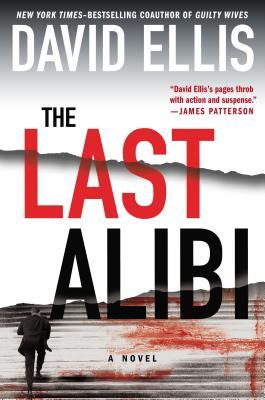
As an example, I’ll dissect the names of my three published short stories and show you the thought process behind them.

The Bardach was named for the race Amyli (Nameless) comes from. They’re a central key to that world because they have the link to its gods. All the conflict revolves around them fighting against the Mages who want to destroy that link and corrupt the gods for their own purposes. Since they are essentially the heart of the story, it seemed fitting to name it after them. Plus it’s a short, interesting title that might make someone click on the link, buy the magazine, or read the excerpt.

(2014 UPDATE: The rewrite of this story now goes by the name Kindred, as it’s a more character-driven, dual POV version that centers around the main character, rather than the culture. When its released, you’ll see. It’s been completely stripped down and rebuilt into what feels almost like an entirely different story, hence the need for a new name. The thought process I went through to choose the name, however, is the same as outlined above. 😉 )

Spinning has a more complicated meaning. It refers to the sect of people Taylor becomes part of, but it also refers to the ability to morph time that they all have, so named because it literally spins the world around them. It also refers to the emotional turmoil Taylor feels throughout, as his world is completely turned upside down, inside out, and sideways. He’s left with a confusing mess of half-answered questions, and is emotionally off-kilter for the entire story — spinning, as it were. It’s also a subtle tip-of-the-hat to the inspiring song by Jack’s Mannequin of the same name. Most of these connotations a reader wouldn’t grasp until after they’re read the piece (and some they might never know), but it adds layers to the title for them to discover along the way. Plus, it’s short, to the point, and hopefully mysterious enough to draw someone in.

Confessions has a dual meaning. It actually does refer to the characters confessing hidden truths, so it’s perhaps one of the more literal titles I’ve used. The thing that makes it interesting is its mysteriousness.  Its vague meaning hopefully makes a reader want to know what’s being confessed and would get them to buy the story to find out. But it’s multi-layered enough that they’ll get the full meaning only at the end. I can’t disclose much about this one without giving away spoilers, so I’ll just say that the obvious confession (Constia’s) isn’t the only one the reader comes across. Plus “Confessions” seemed like the perfect title for a story about losing faith.

Now, my process may not be your process, and that’s perfectly okay. The goal here was to get you to reconsider your approach to titles. The lesson in the above examples is that what appear to be simple one or two word statements, are actually layered with meaning and perfectly embody the message of the piece. Which is the ultimate goal of a title, isn’t it? (If you answered “no” to that, then I think you seriously need to reappraise your opinions of titles, and why did you bother to read this whole huge novel of a post? Just saying.) However you go about finding your names, the important thing to remember is that they are just that — important. Don’t spend months or years of your life on a project and then give it a half-assed name. You poured part of yourself into that thing! Give it enough respect to name it accordingly. You’ll be surprised how effective a marketing tool a simple title can be. It may just be the difference between massive success and complete failure. And I don’t know about you, but when so much hangs on a single decision, I think it deserves a few extra moments of my time to get right.

How to Judge a Book by Its Cover

After spending the past several weeks learning the ins and outs of cover design, I found myself thinking more about the other side of the fence — the buyer’s side. I tend to browse bookstores rather aimlessly, as I’m sure a lot of us do, waiting for something to pop out and grab me. We’ve always been told, “Don’t judge a book by its cover.” But that’s exactly what we do. We can’t help it; it’s instinct, a way to filter the walls and walls of choices and prevent information overload. What actually makes a cover design stand out against the others, though? What hidden information are we subconsciously told in a glance? We saw glimpses of it during Ashley Ruggirello’s excellent series, but I wanted an opinion from outside the design world, from someone whose job isn’t necessarily to create the covers, but to judge them.

So I recruited Elizabeth Watson. Some of you may recognize that last name from a post I wrote back in May announcing the release of A Foundation in Wisdom, and you’d be correct. Elizabeth is Robert’s wife. But more importantly, she’s a librarian. She faces the same predicament we do when stepping into a bookstore, just on a much larger (professional) scale. So stick around, listen to her tips for deciphering the subtle language of book covers, and then be sure to check out A Foundation in Wisdom!
 

How to Judge a Book by Its Cover


By Elizabeth Watson

 
As Kisa mentioned, I’m a librarian for a small, rural library. My job duties include purchasing books (monthly) for the library and recommending titles to our patrons. As a librarian, I feel it’s important to know your community and what they like/want to read. But obviously, I don’t have time to read every book out there, and there are some genres that appeal to me more than others. So how can I tell whether or not to buy or recommend a title? By looking at its cover. Publishers put a lot of time and money into the cover design, so take advantage of it.

Here are some things I tend to look at while making my decisions:
 

The Title and Cover Art:

 
The cover will let you know the genre. For example:
 
The Sum of All Kisses by Julia Quinn
 
You can tell this is a romance. (And, by the way, a good rule of thumb is: the more skin showing on the cover, the more sex scenes you’ll find inside.)

Whereas this:
 

The Last Alibi by David Ellis

 
…clearly isn’t. Based on the endorsement from James Patterson and the imagery, it’s safe to say The Last Alibi is a suspense novel.

The cover can also give you a hint about location. For example:
 

Discretion by Allison Leotta
 
If you recognize the building on the cover of Discretion, you can tell it takes place in Washington, D.C.
 
The Bone Bed by Patricia Cornwell
 
The Litigators by John Grisham
 
Also, pay attention to the presentation of the author’s name; the more real estate it takes up, the more likely you are to be looking at a famous, established author (as illustrated above).
 

Author Recommendations:

 
Getting endorsements from established writers can really help sell your book.  If the book you’re looking at has author recommendations and you’re familiar with that author, you can probably safely say the book in your hand will be similar to those written by the endorser. For example:
 
Iron Kissed by Patricia Briggs
 
Charlaine Harris writes paranormal romance, so you can guess that Iron Kissed is probably a paranormal romance, too.  (I would say it’s also safe to guess that the main character isn’t very quiet and conservative based on the tattoo.)  But if you don’t have a famous author to provide you with a quote, quotes from reviewers are helpful, too.  I just recommend making sure the quote tells the reader or purchaser what to expect from the book — should they expect a lot of action? Courtroom drama? Vampires? Fantasy?
 

Awards or Prizes:

 
The Replacement Child by Christine Barber
 
As a reader/purchaser, I definitely pay attention if a book has received a prize. A few examples of awards given to authors are the Edgar award for mysteries, the Christy award for Christian fiction, and the RITA award for romances. Being nominated is impressive even if you didn’t win, so you should brag up your nomination on the cover, too.
 

Additional Things that Factor into Purchasing:


  • Patron requests — if one of our patrons asks for it, I try to buy it.
  • Variety and diversity — I try to get something for everybody, something to represent all the genres. And, of course, I try to buy the big-name, bestselling authors when they come out with a new book.
  • Local authors.
  • Reviews — the Library Journal, Kirkus Reviews, newspapers, and other print sources are helpful. I also look at online reviews at Goodreads, Amazon, and Fantastic Fiction, as well as BookPage, and BookReporter. And I buy the Oprah’s Book Club selections and books that get reviewed in O: The Oprah Magazine.
  • If we have some books in a series, I will try to complete it.
  • Impressive covers with good reviews or endorsements from famous authors.
  • Local Book Club Requests — book clubs often tell me what title they’re planning to read next, and I’ll buy copies of their selection for the library.

Well, those are my thoughts. I hope you find them interesting and useful. The world of cover design is an intricate thing from start to finish. A lot goes into the design side, but nearly as much goes into the decision to buy. If you keep some of these key elements in mind while you create, I’m sure you’ll be able to wow the world with your covers.

Designing a Book Cover: Tutorial Part 2

Welcome to week 6 of Ashley Ruggirello’s guest post series and part 2 of her guided walk-through.

For those just joining us, meet Ashley, Creative Director/Founder of REUTS Publications, and owner of freelance design company, Cardboard Monet. Over the past weeks, she’s been sharing her design expertise, taking us through the process behind designing a book cover. From inception to finished product, she’s illustrated the collaborative steps authors and designers go through, using my nemesis WIP as the guinea pig. But it’s not over yet!

Last week, she began a step-by-step breakdown of how she created this beautifully subtle piece of art. Today is part 2, and there’s one more installment scheduled for next week. That means, in two week’s time, I’ll finally reveal the exciting announcement I’ve been hiding. So stick around, learn some of Ashley’s tricks and find out what I’m keeping up my sleeve. We’re almost there, I promise! ;)
 

Chapter 6: Unmoving Tutorial Continued


By Ashley Ruggirello

 
If you’re just now joining us on this cover designing adventure, I’d suggest picking up from Chapter 5, where we begin the tutorial, or Chapter 1, to see how far we’ve come. Last week we ended with a good base image of a color-adjusted and textured bench:
 
Screen Shot 2013-10-21 at 9.06.52 PM
 

And again, the basic design elements


Part II: Step-By-Step Tutorial for the Unmoving Book Cover

 
Bring in the filigree
 
To start, we’re going to jump right in to the floral filigree, which is — by far — the more difficult part. Bring the floral filigree into your Photoshop document by your preferred method (c+p, drag/drop, etc…) as a new layer, above the work we’ve already done. You’ll want to Transform (CTRL/Command +T) and rotate the image -5.77 degrees to the left, to get it in a similar location as the final. Of course, you can also omit this step.
 
Screen Shot 2013-10-28 at 6.28.41 PM
 
Set the layer to Lighten and you’ll see a very gray silhouette of the filigree:
 
Screen Shot 2013-10-28 at 6.29.54 PM
 
Screen Shot 2013-10-28 at 6.56.23 PM
 
To get that gold color, we need to mess with the image Hue & Saturation by going to Image > Adjustment > Hue and Saturation:
 
Screen Shot 2013-10-28 at 6.31.16 PM
 
Click the Colorize option. This is where a lot of playing around, and guess/check comes into play. If you select Preview you can see your progress before committing to anything. I set Hue to “45”, Saturation to “24” and Lightness to “+15”.
 
Screen Shot 2013-10-28 at 6.32.11 PM
 
It’ll give you that gold color on just the filigree element.
 
Screen Shot 2013-10-28 at 6.54.21 PM
 
But the filigree in the sky is too light, so duplicate the layer by either clicking CTRL/command + J or right-clicking the layer and selecting Duplicate Layer:
 
Screen Shot 2013-10-28 at 6.36.22 PM
 
Set this layer to “49%” Opacity:
 
Screen Shot 2013-10-28 at 6.53.47 PM
 
There, that’s a little better! But now we have all that crap over the bench that we definitely don’t need. Here’s another section that’s guess-and-check. Take those two filigree layers and put them in a group of their own by highlighting them both and hitting CTRL/Command + G or right-clicking and clicking the folder icon at the bottom of your layer window:
 
Screen Shot 2013-10-28 at 6.40.00 PM
 
Your two filigree layers should now be in their own group, easy to edit at the same time, which is what we’re about to do! Using that same icon bar above, hit the icon with the circle in the square to create a mask.
 
Screen Shot 2013-10-28 at 6.41.57 PM
 
This adds a white box next to your group, which — in essence — allows us to erase any element within the group without truly editing the image itself. That way, if we ever need to go back and make changes, we don’t lose the authenticity of the original:
 
Screen Shot 2013-10-28 at 6.42.34 PM

(Disregard that mine says “Group 9”, yours will likely say “Group 1”)


Now, make sure you’re selecting the mask (it should have a the frame around the corners when selected as seen above), and select the Eraser tool. You can hit “E” on your keyboard to pull it up, or find the eraser icon in your left toolbar:


Screen Shot 2013-10-28 at 6.45.17 PM


From the color selection at the bottom of your toolbar, make sure the foreground color is set to white:


Screen Shot 2013-10-28 at 6.46.14 PM


We’re moving all around your screen now. Looking at the top toolbar, select the brush size and shape. Make sure it’s set to a fuzzy circle, at any given size (mine is 300px):


Screen Shot 2013-10-28 at 6.47.17 PM


Screen Shot 2013-10-28 at 6.48.23 PM

 
Working back on your art board, begin to “erase” the filigree overlapping the bench and surrounding area. You’ll notice your mask on the group layer turn black where you’ve erased:
 
Screen Shot 2013-10-28 at 6.50.11 PM
 
Screen Shot 2013-10-28 at 6.52.59 PM
 
I can’t say exactly how I erased, but you can see my mask on the guide layer as a general idea. The lighter grays were created by changing the opacity of my eraser, so I wasn’t deleting as much.

And there you have it! The filigree has been added to your design.
 
Typesetting title, author name, and tagline
 
(Even though I consider this the easiest part of the design, Kisa and I still went through multiple combinations and options before settling on the final._

Let’s start with the tagline…

The fonts used were “Gotham – Light” and “Gotham – Bold”, for the unbolded and bolded words, respectively, at a size of 9pt. (Here’s where you can sub for Century Gothic.) All you really have to do is type out:

“Everyone has a limited supply of good karma. What happens when it’s gone?”

Break the line between the sentences, center it nicely in the sky, and you’re all set with the tagline:
 
Screen Shot 2013-10-28 at 7.01.31 PM
 
Next, the title. The title is “Proxima Nova Alt Condensed – Light” at font size “64pt”. You can also sub “Collaborate – Thin“. Type out “Unmoving” in all UPPERCASE (the font color doesn’t matter at this point) and place it evenly between the tagline and the top of the bench:
 
Screen Shot 2013-10-28 at 7.05.20 PM
 
Back in your layers window, change the fill to “0%”
 
Screen Shot 2013-10-28 at 7.06.13 PM
 
You’ll notice the font has disappeared, but that’s okay! That’s what we want. Make sure you have the text layer selected, and from the layer toolbar at the bottom of your window, click the FX icon and select “Drop Shadow”:
 
Screen Shot 2013-10-28 at 6.40.00 PM
 
Screen Shot 2013-10-28 at 7.09.34 PMThis will open the Effects window, where you can change the Distance to “5”, Spread to “89”, Size to “1” and Angle to “150”:
 
Screen Shot 2013-10-28 at 7.10.57 PM You’ll now see a really cool, shadowed text:
 
Screen Shot 2013-10-28 at 7.12.09 PM
 
And, boom. The title. 🙂

The last piece of text is Kisa’s name. It’s also in  “Proxima Nova Alt Condensed – Light” at size “14pt”. (You can sub “Collaborate – Thin“.) Type out “Kisa Whipkey” in all UPPERCASE, and place it right below the title, centered on the art board.
 
Screen Shot 2013-10-28 at 7.15.42 PM
 
Similar to the title, open the Drop Shadow Effects window, and set the Blend Mode to “Normal”, Opacity to “75”, Angle at “150”, Distance to “1”, Spread to “0” and Size to “1”:
 
Screen Shot 2013-10-28 at 7.16.37 PM
 
After hitting “OK”, all the text in the design is complete!
 
Screen Shot 2013-10-28 at 7.17.54 PM
 
Last, but certainly not least, we’ll address the necklace sitting on the bench, and finish off the Book Cover Art Series! I hope you’ve enjoyed (and found useful) this step-by-step tutorial. As always, if you have any questions, please don’t hesitate to ask. That’s what I’m here for!

Two Steps Closer Giveaway

If you’ve ever considered self-publishing, then you know the two most expensive things you should invest in, (according to all the self-publishing gurus out there), are editing and cover design. But what if you don’t have the funds?

Or maybe you’re thinking of pursuing traditional publication, and would like to have an editor’s opinion on whether or not your manuscript’s ready. Do you really want to pay a freelance editor’s wage for that?

Maybe you’ve already had your book torn apart and pieced back together by a professional and you’re just missing the cover to complete the package.

Whatever your circumstance, listen up.

The folks over at REUTS Publications are generously donating their time to two lucky winners. One will win a full-scale editorial critique from Editor Kisa Whipkey. (Hey look! It’s me! :P) The other will win a custom, print-ready cover design by Creative Director Ashley Ruggirello. And the best part is, there are no strings attached. You get professional-grade services without the contract.

All you need to enter is a Facebook account and a finished manuscript. Sounds like a fantastic opportunity, no? For more information on how to enter, click here.

The giveaway runs until midnight on March 25th, 2013. Don’t miss out! Let the REUTS team help you get “Two Steps Closer” to publication.

Designed by REUTS Creative Director Ashley Ruggirello, 2013

Designed by REUTS Creative Director Ashley Ruggirello, 2013

Introducing REUTS Publications

I’m very excited to announce that I have joined the Editorial Staff at REUTS Publications. And I felt it was only right to celebrate with a shameless plug for my new employer. 😉

REUTS Publications is an independent Publishing Agency created by authors for authors. Our goal is to redefine the author/publisher relationship by shifting the balance of power to the author. In essence, when you join our family, we work for you, helping to realize the vision you see for your work. Which is why we offer higher than industry-standard royalty rates, and why we only get paid when you do. We’re not a vanity press; you never pay up front for our services. Rather, we’re like your support staff, people who are equally invested in the success of your project and can help shoulder the burden of publishing.

Our staff is experienced in a wide range of services, from editorial, to design and marketing, and most importantly, publishing. All of our staff members are authors themselves, and are well acquainted with what it takes to succeed in this ever-changing world of publishing. We’ve been through the agonizing process of querying, waiting and waiting for responses that never came, or letters that only contained rejection. We’ve experienced the joy and frustration of finally landing a book contract, only to realize we’d no longer have control over our work if we signed it. And we think there should be a better way. We believe that authors should direct the show. It’s your work; you slaved for hours and hours, months and years over it. You should reap the benefits.

We offer one-on-one feedback from one of our editors, (like me!), author-driven design elements, including cover design, interior layout and an author website hosted on REUTS.com, and marketing assistance to authors who don’t want to travel the daunting road to publication alone. Whether you’re tired of trying to catch the attention of a traditional publisher, or are interested in self-publishing but have limited funds, we can help.

For more information on who we are and what we do, including our submission guidelines, (we can’t accept everything unfortunately), check out our website, our Facebook page, or our Pinboard on Pinterest. And in honor of our launch, we’re giving away a Vintage Book Safe to one lucky recipient on Dec. 10, 2012. Click here for details.

This is an exciting time in publishing with many avenues to success. Help us redefine what it means to be an author.