Welcome to week 6 of Ashley Ruggirello’s guest post series and part 2 of her guided walk-through.
For those just joining us, meet Ashley, Creative Director/Founder of REUTS Publications, and owner of freelance design company, Cardboard Monet. Over the past weeks, she’s been sharing her design expertise, taking us through the process behind designing a book cover. From inception to finished product, she’s illustrated the collaborative steps authors and designers go through, using my nemesis WIP as the guinea pig. But it’s not over yet!
Last week, she began a step-by-step breakdown of how she created this beautifully subtle piece of art. Today is part 2, and there’s one more installment scheduled for next week. That means, in two week’s time, I’ll finally reveal the exciting announcement I’ve been hiding. So stick around, learn some of Ashley’s tricks and find out what I’m keeping up my sleeve. We’re almost there, I promise! ![]()
Chapter 6: Unmoving Tutorial Continued
By Ashley Ruggirello
If you’re just now joining us on this cover designing adventure, I’d suggest picking up from Chapter 5, where we begin the tutorial, or Chapter 1, to see how far we’ve come. Last week we ended with a good base image of a color-adjusted and textured bench:

And again, the basic design elements
- The bench background. (Unlimited usage on DeviantArt.com; Permission needed off-site)
- Floral filigree. (Free to use if credit provided)
- Necklace inspiration. (Used only for inspiration, as the final necklace was drawn in)
- Stripe generator. (Generate the stripe texture)
- Proxima Nova font. (Feel free to sub with Collaborate – Thin, font)
- Gotham font. (Feel free to sub with Century Gothic font, standard on most operating systems)
Part II: Step-By-Step Tutorial for the Unmoving Book Cover
Bring in the filigree
To start, we’re going to jump right in to the floral filigree, which is — by far — the more difficult part. Bring the floral filigree into your Photoshop document by your preferred method (c+p, drag/drop, etc…) as a new layer, above the work we’ve already done. You’ll want to Transform (CTRL/Command +T) and rotate the image -5.77 degrees to the left, to get it in a similar location as the final. Of course, you can also omit this step.
![]()
Set the layer to Lighten and you’ll see a very gray silhouette of the filigree:


To get that gold color, we need to mess with the image Hue & Saturation by going to Image > Adjustment > Hue and Saturation:

Click the Colorize option. This is where a lot of playing around, and guess/check comes into play. If you select Preview you can see your progress before committing to anything. I set Hue to “45”, Saturation to “24” and Lightness to “+15”.

It’ll give you that gold color on just the filigree element.

But the filigree in the sky is too light, so duplicate the layer by either clicking CTRL/command + J or right-clicking the layer and selecting Duplicate Layer:

Set this layer to “49%” Opacity:

There, that’s a little better! But now we have all that crap over the bench that we definitely don’t need. Here’s another section that’s guess-and-check. Take those two filigree layers and put them in a group of their own by highlighting them both and hitting CTRL/Command + G or right-clicking and clicking the folder icon at the bottom of your layer window:
![]()
Your two filigree layers should now be in their own group, easy to edit at the same time, which is what we’re about to do! Using that same icon bar above, hit the icon with the circle in the square to create a mask.
![]()
This adds a white box next to your group, which — in essence — allows us to erase any element within the group without truly editing the image itself. That way, if we ever need to go back and make changes, we don’t lose the authenticity of the original:
![]()
(Disregard that mine says “Group 9”, yours will likely say “Group 1”)
Now, make sure you’re selecting the mask (it should have a the frame around the corners when selected as seen above), and select the Eraser tool. You can hit “E” on your keyboard to pull it up, or find the eraser icon in your left toolbar:
![]()
From the color selection at the bottom of your toolbar, make sure the foreground color is set to white:
![]()
We’re moving all around your screen now. Looking at the top toolbar, select the brush size and shape. Make sure it’s set to a fuzzy circle, at any given size (mine is 300px):
![]()

Working back on your art board, begin to “erase” the filigree overlapping the bench and surrounding area. You’ll notice your mask on the group layer turn black where you’ve erased:
![]()

I can’t say exactly how I erased, but you can see my mask on the guide layer as a general idea. The lighter grays were created by changing the opacity of my eraser, so I wasn’t deleting as much.
And there you have it! The filigree has been added to your design.
Typesetting title, author name, and tagline
(Even though I consider this the easiest part of the design, Kisa and I still went through multiple combinations and options before settling on the final._
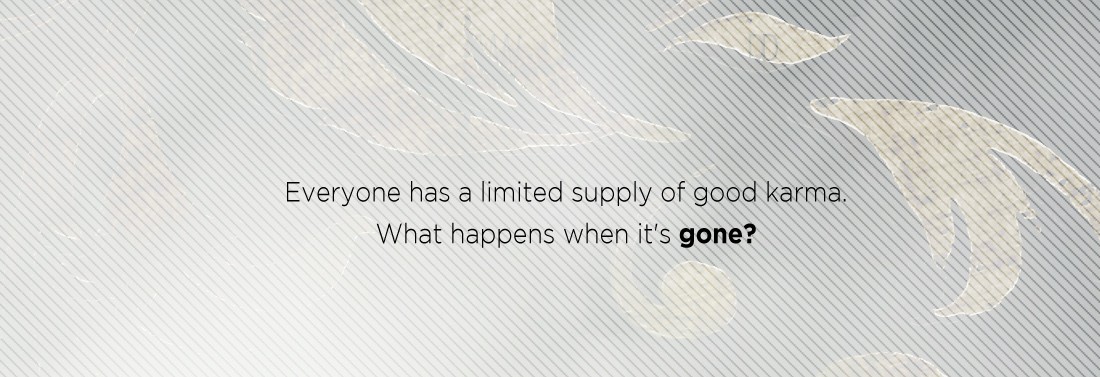
Let’s start with the tagline…
The fonts used were “Gotham – Light” and “Gotham – Bold”, for the unbolded and bolded words, respectively, at a size of 9pt. (Here’s where you can sub for Century Gothic.) All you really have to do is type out:
“Everyone has a limited supply of good karma. What happens when it’s gone?”
Break the line between the sentences, center it nicely in the sky, and you’re all set with the tagline:

Next, the title. The title is “Proxima Nova Alt Condensed – Light” at font size “64pt”. You can also sub “Collaborate – Thin“. Type out “Unmoving” in all UPPERCASE (the font color doesn’t matter at this point) and place it evenly between the tagline and the top of the bench:

Back in your layers window, change the fill to “0%”

You’ll notice the font has disappeared, but that’s okay! That’s what we want. Make sure you have the text layer selected, and from the layer toolbar at the bottom of your window, click the FX icon and select “Drop Shadow”:
![]()
 This will open the Effects window, where you can change the Distance to “5”, Spread to “89”, Size to “1” and Angle to “150”:
 You’ll now see a really cool, shadowed text:

And, boom. The title. 🙂
The last piece of text is Kisa’s name. It’s also in “Proxima Nova Alt Condensed – Light” at size “14pt”. (You can sub “Collaborate – Thin“.) Type out “Kisa Whipkey” in all UPPERCASE, and place it right below the title, centered on the art board.

Similar to the title, open the Drop Shadow Effects window, and set the Blend Mode to “Normal”, Opacity to “75”, Angle at “150”, Distance to “1”, Spread to “0” and Size to “1”:

After hitting “OK”, all the text in the design is complete!

Last, but certainly not least, we’ll address the necklace sitting on the bench, and finish off the Book Cover Art Series! I hope you’ve enjoyed (and found useful) this step-by-step tutorial. As always, if you have any questions, please don’t hesitate to ask. That’s what I’m here for!

Amazing. I’m too nervous to even use Instagram.