Featured Image: “Sweetheart Ronin” Illustration

Happy Halloween! Originally, I was intending to post my thoughts on literary voice this week, but given that it’s a holiday (and the fact the conference I was supposed to speak at was cancelled), I’ve decided to showcase something a little more spooktacular (yes, horrible pun intended) instead. Some of you may be familiar with the Project REUTSway competition Reuts Publications hosted last year, challenging writers everywhere to pen new and twisted versions of your favorite fairy tales. No? You don’t remember that? Well, you’re in luck then, because it just so happens to have released today. That’s right, FAIRLY TWISTED TALES FOR A HORRIBLY EVER AFTER is available in eBook now! And will be available in a special hardcover edition in a couple weeks. I highly suggest you all check it out; it’s amazing!

But that’s not the point of today’s post (okay, not the whole point). I’m actually going to do a rare art feature. See, I was lucky enough not only to be involved with the selection of the gruesomely fantastic tales in the anthology, but also to create one of the many illustrations included within its pages. And trust me, there are some truly beautiful works of art in this thing. Want a taste? Well then, let me present my illustration for a story called “Sweetheart Ronin” by the talented Suzanne Morgen:

"Sweetheart Ronin" Illustration by Kisa Whipkey


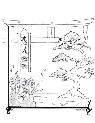
Created to evoke the style of the setting (Japan, in case you’re wondering), this piece is a combination of traditional drawing with pencil and Sharpie (yes, Sharpie. Who knew, right?) and digital vector graphic created in Adobe Illustrator. In order to understand the significance of the elements, you’ll have to read the story, which can be located here. Buy it. Seriously.

And for those of you curious about Project REUTSway, click here. The 2014 competition, featuring challenges rooted in world mythology, kicks off tomorrow and runs all November long. So if you’re looking to flex those writing muscles, but NaNoWriMo is too daunting/impossible, head on over and check it out. Who knows? Maybe I’ll end up drawing an illustration for you in next year’s anthology. 😉

Advertisement

Featured Animation: Nightwolf Productions Logo

Many of you know that my first creative aspirations were in the realm of animation. But how many of you have actually seen something I’ve animated? Exactly one–my mom, and she doesn’t count. (Sorry, Mom!) I think it’s high time I fixed that, so I’m going to reveal a small piece I did during college. I had something else planned for this week, but if I don’t post this now, I’ll lose my nerve and you’ll never get to see it. What am I afraid of? I’m not sure. I’ve just never really showcased my animation skills, even though, supposedly, I’m pretty good. But, like all things creative, it’s hard to trust the opinions of others when you’re your own worst critic.

Anyway, I’m stalling. The following video is a line drawing (known as a pencil test) of my non-existent animation company’s logo–Nightwolf Productions. If you’ve followed me for a while, you may remember me talking about how I envisioned a living logo, inserting the Nightwolf into the beginning of each film like a seamless part of the story. This is not that. This would be akin to the standardized logos you see–Dreamworks’s moon, or Disney’s castle. It features a basic walk cycle, a howl, and the company name. Sounds so simple, doesn’t it?

It’s not. Each frame took roughly an hour to draw, and a four-legged walk cycle is notoriously the most difficult thing to capture. So between the hours I spent watching my dog running around, and the hours spent drawing, you’re probably looking at upwards of 100 hours of work. That doesn’t include the time spent mixing the soundtrack and sound effects (because, yes, I did create that music mash-up you hear in the background) nor the time spent inputting/syncing everything in Flash. My point? Animation is hard.

But when it all comes together and you hit play, seeing your drawings come to life for the first time, it’s oh so worth it. Even now, years later, I can’t watch this without a stupid grin of pride plastered to my face. So here’s hoping you enjoy it!


**This video was created as part of a college assignment. It’s solely for personal use and has never been used for profit or actual business transactions. Nightwolf Productions is a fictitious company name.**

Music Credits: (I mixed the music, but I do not stake any claims to it beyond that. These are the people truly responsible for creating it.)

“Prologue” by Alan Menkin, from the Broadway rendition of Beauty and the Beast. Copyright belongs to Disney Theatrical Productions, LTD.

“Bonus Track” by Guy Whitmore, from the Shivers 2: Harvest of Souls Soundtrack (featuring music from the original Shivers game–i.e. the wolf howl). Copyright belongs to Sierra Entertainment, Inc.

Animation Credits:

Art and animation by Kisa Whipkey. Copyright, 2008. All rights reserved.

Featured Image: The Anchor

One of my non-writing resolutions for 2014 is to showcase more of my art. I call myself an artist, (I even paid a boatload of money for a piece of paper certifying me as such) but all anyone’s ever seen from me is a single image.  So we’re going to change that. I realize this blog is primarily known for its writing/publishing advice. But you’ll bear with me if I slip in a few art-related posts, right? Especially if, like this one, they somehow pertain to my writing? I hope so, anyway, because here goes . . .
 

The Anchor

 
Image by Kisa Whipkey
 

Some of you may already be able to guess what this illustration is referencing, but for those who don’t know, let me explain. This is Nameless, from The Bardach.

The inception of the short story was pretty simple; it was written solely to explain how Amyli became Nameless, the lead Storyteller and anchor for the Nightwolf. What’s an anchor? It’s like a link, an access point. She’s essentially an empty vessel, strategically placed so that he can leave his realms and muck around in the human one. Wiped of her identity, Nameless’s mission is to travel around, imparting the messages the Nightwolf wants her to. Once human, she’s now a shifter, able to transform into the Nightwolf at whim.

There’s much more to their story, but that’s pretty much all you learn by reading the short version. This image was created around the time I was trying to figure out exactly what their relationship was. Originally, the Nightwolf didn’t have a companion, but after I realized that he was more than simply my logo (I’ve explained this in much more detail here), Nameless appeared. And once it became clear what her purpose was, The Bardach was born.

The sketch version doesn’t contain the wolf image. I’m actually more proud of that than this version, which was created in Adobe Illustrator after. But I couldn’t get it to translate well, so this version will have to do. Plus, you get to see one of my original interpretations of the bond between Nameless and the Nightwolf. Is this how it actually happens in the story? No. It isn’t. She fully transforms, because halfling werewolves are one of my pet peeves.  But this is meant to be a visual representation of their spirit bond, illustrating the fact that she has a wolf’s soul in place of her own.

If you’d like to learn more about Nameless or the Nightwolf, I suggest checking out their story. There’s an excerpt featured in my Published Works section, and there will be a new version releasing by the end of the year. Thanks for letting me share one of my images. I hope you’ve enjoyed this brief interlude from our normally scheduled program. Next week, I’ll be back with something more standard. What? I’m not sure yet, so if anyone has a request, please let me know! 😉

Featured Image: Myusa Won Hwa Logo

Last week, I promised you art. This week, I’m making good on that promise (Finally! Right?) and starting a new series of blog posts– the Featured Image. This will be an on-going series where I showcase work I’m particularly proud of or that has some other reason for being of particular note. Since I’m offering the possibility of a logo design as one of the prizes in my blog-birthday giveaway, it’s only right to kick-off this new series with a logo.

So, without further ado, I present my best logo design to date:
 

The Myusa Won Hwa Logo

(which means “Warriors of the Original Flowers” in Korean, by the way)


Myusa Won Hwa Logo

 
This was a commission by Dragon Heart Tang Soo Do owner, Master Becky Rupp. Tired of the stories of violence against women that are growing ever more prevalent (along with violence against everyone), Master Rupp decided to take action, creating a curriculum designed specifically for women and girls. The martial arts have long been touted as a means of self-defense, but the sad truth is that the majority of techniques taught simply don’t work in the real world for women or children faced with a larger assailant. Master Rupp’s curriculum does.

She took aspects of her traditional Tang Soo Do training, along with influences from Larry Wick’s Split Second Survival and created a modified curriculum that plays to the strengths of “the weaker sex.” Charged with a desire to see all females armed with the ability to protect themselves and the wherewithal to avoid dangerous situations in the first place, she then offered it to her small Northern California community for free.

Since it’s a separate class from the Tang Soo Do curriculum taught under the Dragon Heart brand, Master Rupp wanted to create a separate, unique identity for it. That’s where I come in. I was hired to create a logo that reflects the spirit of female warriors, something both hard and soft, feminine and strong. The result is the image above.

I chose to use the lotus flower because it is a long held symbol for over-coming adversity, for strength even in darkness. I paired it with the flourishes to create a distinctly girly design. The addition of the sword is an obvious reference to warriors, and the high heels, purposely colored to mimic a certain famous shoe-maker (you know who I mean, ladies! 😉 ) are meant to represent a woman’s power. Stiletto’s have long been tied to female sexuality, but those of us who wear them will tell you that they’re also empowering (and hurt like hell!). Somehow, torturing our feet for the sake of fashion makes us feel stronger, prettier, and more confident. Which is why they’re perfect in the logo of a class that upholds those same ideals.

The color choices weren’t as complicated– red, because the bottom of the shoes had to be red and it’s Master Rupp’s favorite color; pink, because that’s the color of girly; and black to create the harsher lines meant to evoke an Asian influence. (Plus everything looks good with black!) I threw it all into a mixing pot, stirred it up for about 30 hours and voila! The Myusa Won Hwa Logo was born.

Master Rupp’s class continues to flourish, and she continues to offer it to the community for free, encouraging women of all ages to train. But nothing can operate without some sort of funding. I will be creating and launching a product line featuring the logo to help fund this worthy cause later this year. (Watch for the announcement!) In the meantime, if you would like to help keep this program afloat, (and hopefully someday allow it to expand to a region near you), you can make a donation to Dragon Heart Tang Soo Do’s non-profit sister organization, The Dragon Heart Foundation, whose mission is to help under-privileged and at-risk youth train in the martial arts.

And don’t forget, my giveaway is still running. You could win a custom logo design like the one above, or your choice of two other prizes. For every 100 entries I receive, I’ll add another winner slot. Meaning, if I get 200 entries, 2 people will win; 300 entries, 3 winners, etc. How’s that for added incentive? If you haven’t entered yet, click here. Don’t miss out!