Designing a Book Cover: The Big Reveal

Welcome to week 5 of Ashley Ruggirello’s guest post series and the big reveal of Unmoving’s official cover!

For those just joining us, meet Ashley, Creative Director and Founder of REUTS Publications, and owner of freelance design company, Cardboard Monet. Over the past weeks, she’s been sharing her design expertise, walking us through the process behind designing a book cover. From inception to finished product, she’s illustrated the collaborative steps authors and designers go through, using my nemesis WIP as the guinea pig. And I couldn’t be more happy with the final result. Elegant and sophisticated, like all of her brilliant designs, this cover perfectly embodies the soul of my story. But we’re not quite done!

Over the next couple of weeks, she’s going to give you the step-by-step breakdown of how she created this beautifully subtle piece of art. And at the end, I’ll reveal the exciting announcement I’ve been hiding. Some of you may think you’ve already guessed what it is, but I can guarantee you haven’t. So stick around, learn some of Ashley’s tricks and find out what I’m keeping up my sleeve. We’re almost there, I promise! 😉
 

Chapter 5: Cover Reveal & Tutorial


By Ashley Ruggirello

 
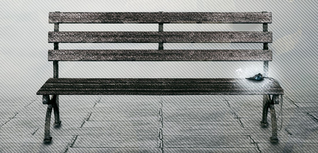
The time has come: the cover reveal for Unmoving. If you’ve followed along from Chapter 1, it’s been a long five weeks as we figured out a starting point, created mock-ups and then some more, until finally, we’re able to debut the final cover. 🙂 Kisa and I have actually been talking about this cover since last Spring, so it’s definitely been a long time coming! No point in delaying any further; it’s my pleasure to reveal Kisa’s cover:
 

Screen Shot 2013-10-21 at 8.10.39 PM
 
This final design has a nice mix of both original mock-ups. The black and white simplicity from the first version, and the filigree/zoomed out bench from the second.

Let us know what you think in the comments, or on Twitter @REUTSpub.
 

Requesting Usage Permission

 
Depending on where you collect your stock, you may or may not need to request permission to use the images. If your stock comes from a stock website library (e.g. IStockPhoto or Veer), you simply have to purchase the image usage rights — just make sure you purchase the image large enough, with a high enough resolution for your needs.

If you prefer to go the route REUTS takes, supporting smaller photographers and interacting with them directly, you always have to request permission, unless otherwise stated. When reaching out to an artist for permission to use their image, you should give a little background on you, and how the image is going to be used:

I’m the Creative Director for an indie publishing company, (LINK), and am interested in using your image (LINK) in one of our new publication’s cover art. We are planning on using it electronically and in print, with credit given inside the book pages.

This is a good jump-off point because you’ve introduced yourself, and explained exactly what your intentions with their image are. Since REUTS always provides credit to the artist (whether they require it or not), I make sure to include it in my initial message. Next, we typically move into what their compensation request might be:

If you’d be willing/interested, please let me know what form of compensation you’d need.

This allows the artist to set their rates/requests, and opens up the conversation to negotiate. Always remember to show your appreciation within an email, not only for their hard work in creating stock, but for taking the time to answer your questions. Give them an opportunity to respond with questions of their own, and make sure you’re easily accessible if they need to contact you off-site (I always like to provide my email address).

Since each situation is different, we can’t provide a thorough walk-through past this initial point of communication, but at least you’ve now begun the conversation, and potential negotiations.

And, like I said, just to be safe, REUTS always includes credit within the printed or digital book:

“Cover Art © YEAR ARTIST-NAME”


The Basic Design Elements


Step-By-Step Tutorial for the Unmoving Book Cover

 
Create a new Photoshop document with the dimensions 5.5″ x 8.5″ and a resolution of 200:
 

Screen Shot 2013-10-21 at 8.20.32 PM

You’ll notice this art board size does not have a built-in bleed. Because Kisa needed this cover primarily for online purposes, I figured when the time comes for this to be used as a print cover, I’d be able to easily adjust the image to fit the additional bleed. Given the nature of the background image, it won’t be hard to extend off the edge.
 

Import Your Main Image
 

Drag and drop, or CTRL+C/CTRL+P the bench background image into your art board:
 
Screen Shot 2013-10-21 at 8.42.37 PM
 
You’ve probably noticed that this raw image looks much different than the one in the final. That means we have some work to do…
 
Create a New Layer Adjustment – Hue/Saturation
 
From the top menu bar, navigate to Layer > New Adjustment Layer > Hue/Saturation…
 
Screen Shot 2013-10-21 at 8.46.33 PM
 
From the window that opens (mine does so in the right sidebar above my “Layers” tab), set the “Saturation” option all the way to “-100”, which essentially turns your canvas black and white:
 
Screen Shot 2013-10-21 at 8.48.14 PM
 
Then, in your “Layers” tab, set this new adjustment layer to “Soft Light”:
 
Screen Shot 2013-10-21 at 8.49.50 PM
 
Your art board should now look like:
 
Screen Shot 2013-10-21 at 8.50.13 PM
 
There isn’t much of a difference, but colors are more accentuated, and almost have a shine to them.
 
Create a New Layer Adjustment – Curves
 
Again, from the top menu bar, navigate to Layer > New Adjustment Layer > Curves…
 
Screen Shot 2013-10-21 at 8.51.59 PM
 
From the window that opens, create a new point, and set the Output as “128” and the Input as “153”:
 
Screen Shot 2013-10-21 at 8.52.55 PM
 
Your art board should now look a little bit darker:
 
Screen Shot 2013-10-21 at 8.53.25 PM
 

Generate Some Stripes

 
Head over to the aforementioned Stripe Generator to create a free stripe texture. You have quite a few options here, feel free to play around with them for any future projects. This is intended for web design use (it’ll actually generate a seamless, tile-able image you can assign to website elements), but I’ve found it a good resource for print design, too.

Change the options to:

Stripe size: 1
Spacing: 10
Stripe Color (s): Black (or #000000)
 
Screen Shot 2013-10-21 at 8.57.49 PM
 
There’s a window to the left of these options that will refresh to show your new stripe based on these selected options:
 
Screen Shot 2013-10-21 at 8.58.32 PM
 
Click the “Open Fullscreen Preview” link at the top to fill your browser window with this striped texture, which you’ll screen grab and pull into your Photoshop art board:
 
Screen Shot 2013-10-21 at 8.59.44 PM
 
(Of course make sure you scroll down so that “Click to Close” is no longer visible before you take your screen shot. The above is meant to show what you’ll see.)

When you pull it into your Photoshop file, feel free to scale and resize to fit the entire window, then set it to “Overlay” and Opacity “38”:
 
Screen Shot 2013-10-21 at 9.01.44 PM
 
And you should see:
 
Screen Shot 2013-10-21 at 9.05.46 PM
 
Create a New Layer Adjustment – Color Balance
 
Again, from the top menu bar, navigate to Layer > New Adjustment Layer > Color Balance…
 
Screen Shot 2013-10-21 at 9.02.52 PM
 
From the window that opens, create a new point. In the “Midtones” option, set Cyan/Red to “+12” and Yellow/Blue to “+9”:
 
Screen Shot 2013-10-21 at 9.04.24 PM
 
Change “Midtones” to “Shadows” and then set Cyan/Red to “-21” and Yellow/Blue to “-5”:
 
Screen Shot 2013-10-21 at 9.05.15 PM
 
“Color Balance” changes the strength of certain colors within the image. You should now be seeing:
 
Screen Shot 2013-10-21 at 9.06.52 PM
 
And there you have it! The base to the Unmoving cover, and a good stopping point until next week’s post when we’ll add the fonts and filigree. Please don’t hesitate to ask any questions regarding this process. Photoshop has a steep learning curve, but that’s why I’m here. Let me help you!

Designing a Book Cover: More Mock-ups

Welcome to week 4 of Ashley Ruggirello’s guest post series. For those of you who’ve been following along, feel free to jump down to the chapter header. You know the drill by now.

For those just joining us, I’ve teamed up with Ashley, Creative Director and Founder of REUTS Publications, to bring you a series about cover design. (And by “teamed up”, I really mean asked permission to syndicate her work. ;) ) I know nothing about cover design, so why not defer to an expert like Ashley? Because that’s what she is. Not only is she the creative genius behind all of REUTS, she’s also the owner of freelance design company, Cardboard Monet. I’ve had the privilege of watching her talent in action, so I’m extremely thrilled that one of her brilliant designs will be featured on my work.

That’s right, not only will she being giving you inspired insight into the design process, she’s using my nemesis WIP, Unmoving, as the example cover. No, that doesn’t mean I finally managed to finish the darn thing. But after this, I’m certainly feeling inspired to!  So stick around. At the end of the series, I’ll reveal the big announcement I’ve had up my sleeve. If you’re a fan of my work, you definitely won’t want to miss it!

Alright, take it away, Ashley!


Chapter 4: More Mocking


By Ashley Ruggirello

 
This week’s post is exciting for me as a designer, because I’m able to show you in a side-by-side view how we use feedback to transform a design. As promised, I’m going to recap Kisa’s thoughts on the original cover mock-ups from Chapter 3, and then give you a chance to catch the subtle, and not so subtle, updates in the new versions. The mock-up and revise process can consist of many rounds, but for the sake of this series, we’re only going to show one. Kisa and I went through a couple more after this point to get to the final design, but those will stay behind-the-scenes. Next week, we’ll debut that final, and jump right into a step-by-step tutorial on how the cover was created. We’ll provide all the stock and styles so you can practice and create the Unmoving cover yourself. Follow along, and we’ll have some fun! 🙂
 

Mock-Up #1

 
Feedback points from Kisa:

  • Can the necklace be more prevalent, maybe with a chain interacting with the text?
  • Add the filigree from mock-up #2 to mock-up #1, faintly in the corners
  • Increase the title, and move it up more.

Overall, Kisa’s feedback regarding mock-up #1 was very positive. I think there was even an “I love this!!!” somewhere in the email, which is great! But, it also makes it more difficult for the second mock-up. I made somewhat of a mistake sending Kisa this first, while working on the second. It allowed her to focus on the design in front of her, develop a love (or hate) relationship with it, and then hold the second to a higher standard. I would recommend sending all mock-ups at the same time, to give a fair comparison of both against one another. Fortunately for me, Kisa has an artistic background, and didn’t let the appeal of mock-up #1 get too much in the way of discussing mock-up #2 😉

Back to the covers…

The contemporary, faint feel of this cover would stand on its own on a bookshelf, and captured many of the main elements of Unmoving, so overall, she was pleased with the direction. I took her feedback and requests, and got to work. To the left is the original, to the right is the updated mock-up #1 (let’s call it mock-up #1.2):
 

Screen Shot 2013-10-10 at 1.11.52 PM

Note: I began to play with the font, but didn’t complete this round of revisions. The same with the chain – since these are just rough mock-ups, I didn’t take the time to shade/accentuate a 3D effect on the chain.
 

Mock-Up #2

 
Feedback points from Kisa:

  • Portland is very lush (constant rain) so the dirt below the bench feels out of place.
  • Try something more along the lines of a gray palette similar to the first mock-up.
  • Apply the same styles but with an image we’ve referenced before, in Chapter 2.

As I expected, after sending mock-up #1 first, mock-up #2 wasn’t received with as much excitement. Kisa had a little more of a clear direction to take this design, though, which is always helpful on my end. Overall, Kisa liked the styles of mock-up #2, but with mock-up #2.2 she wanted to try a new, lighter image.
 

Screen Shot 2013-10-10 at 1.12.42 PM
 
Quite a change, isn’t it? But you can still see how these two designs fall within the same vein: a more prominent bench, a fantastical overlay texture, movement bringing your eye around the design, etc… I’m actually much more pleased with round two of this mock-up, than the first – proof that a design continues to get better and better with collaboration, edits and multiple rounds of reviewing.

We’ll unveil the direction Kisa picked (and together, we finalized) in next week’s post. If you have any questions, please don’t hesitate to leave them in the comments below, or Tweet us: @REUTSpub. I have a favorite, and I have a feeling I know which one Kisa favors, but let us know what you would do, and which you’d pick if you were in her shoes. Maybe you can sway her opinion 🙂

Remember, next week we’ll get into the cover’s creation, meaning over the course of two or three posts, I’ll walk you through the step-by-step process of recreating this cover. You can practice and practice the techniques I’ve used, and maybe apply them to your own cover in the future. It’ll all begin with the Stock Permission Request mentioned way back when, and how to deal with copyrighted stock.

Until then, have a fantastic week, everyone!

Designing a Book Cover: The Mock-Ups

Welcome to week 3 of Ashley Ruggirello’s guest post series. For those of you who’ve been following along, feel free to jump down to the chapter header. You’ve read all this intro stuff before.

For those just joining us, I’ve teamed up with Ashley, Creative Director and Founder of REUTS Publications, to bring you a series about cover design. (And by “teamed up”, I really mean asked permission to syndicate her work. ;) ) I know nothing about cover design, so why not defer to an expert like Ashley? Because that’s what she is. Not only is she the creative genius behind all of REUTS, she’s also the owner of freelance design company, Cardboard Monet. I’ve had the privilege of watching her talent in action, so I’m extremely thrilled that one of her brilliant designs will be featured on my work.

That’s right, not only will she being giving you inspired insight into the design process, she’s using my nemesis WIP, Unmoving, as the example cover. No, that doesn’t mean I finally managed to finish the darn thing. But after this, I’m certainly feeling inspired to!  So stick around. At the end of the series, I’ll reveal the big announcement I’ve had up my sleeve. If you’re a fan of my work, you definitely won’t want to miss it!

Alright, Ashley. You’re up!
 

Chapter 3: Mocking Up the Mock-Ups


By Ashley Ruggirello

 
I’m going to preface this week’s post by saying the inspiration fairy is an interesting critter who sometimes decides to hide away at the most inopportune times. In the case of this week’s post, I honestly didn’t think I’d be able to get it done in time. Even with a couple different ideas swimming around my head, I still couldn’t get all the other elements to line up: images, styles, fonts, etc. That’s the thing with design, it’s never really reliable. Who knows when inspiration will strike, and when a design will actually come together.

Thankfully, I was able to request a little bit of Kisa’s aid before I restarted my designs. Browsing GoodReads.com, Kisa wrangled together a handful (or two) of already published cover art she felt (in one way or another) captured the Unmoving vibe. I don’t think these mock-ups would have come to be in time had it not been for her hasty help.

Last week, I mentioned discussing how to acquire permission to use stock from artists/photographers, however I’m going to hold off on that until Kisa has finalized a direction, and I know officially what images will be in use. So, without any further ado, this week’s post:
 

Mock-Up #1

 
In addition to using Kisa’s cover selections, I happened to stumble upon my own, which triggered a (small) bout of inspiration.

12024430

Teeth, by Hannah Moskowitz


The grayscale, the slight use of color, the simplicity; this helped with my direction. Given the stock photo collection we gathered, maybe this is a direction I can pursue, I thought. (I think to myself a lot. Sometimes I think it keeps me sane.) I coupled the Teeth book cover with two Kisa provided as additional inspiration:
 
Screen Shot 2013-10-08 at 7.59.10 PM

When the World Was Flat, by Ingrid Jonach


Screen Shot 2013-10-08 at 7.59.41 PM

Thin Space, by Jody Casella


I knew upon seeing these two in addition to Teeth, that I could come up with something. And thus began mock-up number one–
 
Screen Shot 2013-10-08 at 8.04.06 PM
 
A simple, grayscale park bench blurred in the background, with Karma’s necklace dangling off the page to the right (I’m a huge fan of making things extend off the page). Clean and crisp. At this point, I’m hoping Kisa likes something about it. As with any critique, honesty is the best policy. Never feel as if you’re hurting your designer’s feelings by not liking something.

(Please Note: Kisa’s feedback will be incorporated into next week’s post, as we continue to refine a direction, or completely scrap both options. Each new iteration will be coupled with the feedback.)
 

Mock-Up #2


7247856

Hunger, by Jackie Morse Kessler


17465456

Shadows, by Robin McKinley

 
Which led me to the second mock-up:
 
Screen Shot 2013-10-08 at 10.06.27 PM
 
More fantasy, more colors, more movement. More of a full bench as the focal point, along with a light orb texture to tie in the fantasy elements of Kisa’s story. The filigree is meant to look blurred/in motion to add to the suspense/distress in the story.

So, there you have it: the first two initial mock-ups. They’ve been sent to Kisa, and will be modified based on her feedback. (Who knows, if she hates them both, we’ll have to evolve one of the other ideas backstroking in my mind into a cover.) Once a direction is determined, I’ll go through the step-by-step process I actually took to create the final cover.

In the meantime, what do you think? How well did I translate Kisa’s info-dump from last week into these two designs? Let us know in the comments!

Designing a Book Cover: Info Dump to Brainstorming

Welcome to week 2 of Ashley Ruggirello’s guest post series. For those of you just joining us, I’ve teamed up with Ashley, Creative Director and Founder of REUTS Publications, to bring you a series about cover design. (And by “teamed up”, I really mean asked permission to syndicate her work. ;) ) I know nothing about cover design, so why not defer to an expert like Ashley? Because that’s what she is. Not only is she the creative genius behind all of REUTS, she’s also the owner of freelance design company, Cardboard Monet. I’ve had the privilege of watching her talent in action, so I’m extremely thrilled that one of her brilliant designs will be featured on my work.

That’s right, not only will she being giving you inspired insight into the design process, she’s using my nemesis WIP, Unmoving, as the example cover. By the end of the series, Unmoving will be one step closer to being official! And you get to watch it happen. No, that doesn’t mean I finally managed to finish the darn thing. But I can promise you an exciting (well, it’s exciting for me, and maybe the 3 fans I have) announcement regarding it at the end of the series. ;)

So stick around. I can guarantee you won’t regret it.

Ready, Ashley? They’re all yours!
 

Chapter 2: Info Dump to Brainstorming


By Ashley Ruggirello

 
And we’re back. This week we’re moving more into the meat of Book Cover design– and by “meat”, I mean charcuterie type appetizer, because this definitely isn’t the main course!

If you followed the steps I denoted in Chapter 1, you should have an info dump of author knowledge on your hands. I know I do, and that’s the sign of a great start! You can gather a lot of ideas and inspiration from hearing the author (passionately) describe their book.

So we begin…
 

The Info Dump

 
Title: Unmoving

Genre*: Urban Fantasy, NA/Adult

*Note from Ashley: I left this out of our Chapter 1 checklist, but the genre is another supportive piece of information to have. Each genre tends to have its own “style” of cover art, which you can easily refer to for inspiration.

Tagline*: Everyone has a limited supply of good karma. What happens when it’s gone?

*Note from Kisa: This may or may not be included in the final design. I added it solely because it provides a little more information on the core concept behind Unmoving.

Unofficial Synopsis/Blurb*:

“Derek Richards renounced his humanity after losing the woman he loved in a horrific car accident. Like flipping a switch, he turned off his non-cynical emotions– including compassion and empathy– and closed himself off from the world. But, three years later, his callous disregard has finally caught up to him.

After watching his current fling angrily storm out, he meanders through the streets of Portland to his favorite spot–a park bench by the river. His peace and quiet is interrupted by a homeless woman, and he quickly finds himself entangled in a confrontation where money isn’t the only change at stake.

Now, literally turned to stone, he realizes karma’s giving him a second chance. Like Ebeneezer Scrooge minus the helpful ghosts, he has to relive all his bad decisions–every selfish, incorrect choice he’s ever made–and reevaluate his life. If he can’t find a way to redeem himself, he’ll spend eternity as a statue. But after what he’s done, maybe he deserves it.”

*Note from Ashley: I was given the manuscript to read, but, to respect Kisa’s WIP, I’ll only be sharing the blurb she shared with me. It’s a good explanation of her story and what the cover should reflect.

Author’s Ideal:

“Since the park bench is such a pivotal image in the story, I’d really like to feature that. I’d also like to try and keep it recognizable to the setting (Portland, OR). For some reason, I’d always pictured this cover as being almost cheerful, with bright, spring-type colors. (I’m choosing to blame the inspiring song, The Man Who Can’t Be Moved by The Script, for that.) But this really isn’t a cheerful story.  It’s also the first in a darker, urban fantasy series, so for branding purposes, I think we should stay away from my original thought of cheerful.

A large portion of the book is spent in dreams/memories, so something ethereal with a darker edge would probably work better. Tragedy, depression, anger, and anxiety are all heavy elements, but the overall theme is one of redemption, hope, and overcoming the things that weigh you down. The message I hope people take away from it is that it’s never too late to turn your life around, to be the person you want to be. So if we could somehow also incorporate a hint of that hopeful feel, it’d be great. Just so people don’t expect it to be a horror. ;)”
 

The Brainstorming

 
So, with park benches in mind, I began searching all forms of stock images for a useable park bench, or an image that evoked a certain feel, ambiance, etc. Here are some stock image websites I frequent (from most inexpensive to most expensive):

There are many, many, more stock photography websites out there, so shop around and find your favorites. Since this is just the brainstorming phase, I’ll wait to cover how to approach an artist for permission to use their image in next week’s post (mostly applicable with Deviant Art images).

Once I’d found a few images, Kisa and I began sharing ideas back and forth, creating a cover database, and trying to spark any sort of inspiration.
 

Park Bench
mahdesigns-stock on dA
 
I had initially mentioned going with a stark cover, lots of grays, with maybe a pop of color in the bench itself. That’s when she found the above image and brought it to my attention for the the overall feel. We both liked this direction, and began to search for some bench stock that could be manipulated into our cover art:
 
Screen Shot 2013-10-01 at 8.49.28 PM
Undreamed-Stock on dA
 
Screen Shot 2013-10-01 at 8.52.43 PM
YsaeddaStock on dA
 
Some more abstract options:
 
Screen Shot 2013-10-01 at 8.52.24 PM
#803790 on sxc.hu
 
park-bench-241005-m
#241005 on sxc.hu
 
bench-86329-m
#86329 on sxc.hu
 
bench-195336-m
#195336 on sxc.hu
 
Or a super abstract option (my suggestion):
 
Screen Shot 2013-10-01 at 9.02.53 PM

An aerial shot of the Portland, OR park where the book is set.
 
This last suggestion was a stretch for me to even put out there. It would take an aerial view (from either Google Maps or Bing Maps) of the park where the story takes place, with potentially some sort of map marker denoting the bench. It’s very much an abstract approach, but because of that, it may be something worth pursuing.

Cover art is very time consuming to design. It’s always better to return to the author with some ideas, as opposed to jumping right in to creating and possibly wasting your time. With the above ideas as a start (and a couple more swimming around in my head), I’ll come back next week with some initial (and rough . . . very rough) mock-ups for Kisa to react to. Additionally, we’ll discuss how to acquire usage rights from a photographer, should you need to.

Stay tuned!