Welcome to week 2 of Ashley Ruggirello’s guest post series. For those of you just joining us, I’ve teamed up with Ashley, Creative Director and Founder of REUTS Publications, to bring you a series about cover design. (And by “teamed up”, I really mean asked permission to syndicate her work. ![]() ) I know nothing about cover design, so why not defer to an expert like Ashley? Because that’s what she is. Not only is she the creative genius behind all of REUTS, she’s also the owner of freelance design company, Cardboard Monet. I’ve had the privilege of watching her talent in action, so I’m extremely thrilled that one of her brilliant designs will be featured on my work.
) I know nothing about cover design, so why not defer to an expert like Ashley? Because that’s what she is. Not only is she the creative genius behind all of REUTS, she’s also the owner of freelance design company, Cardboard Monet. I’ve had the privilege of watching her talent in action, so I’m extremely thrilled that one of her brilliant designs will be featured on my work.
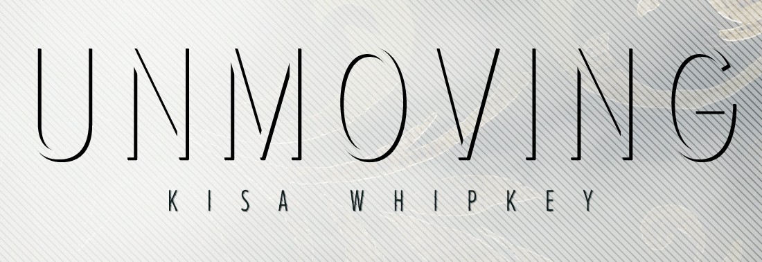
That’s right, not only will she being giving you inspired insight into the design process, she’s using my nemesis WIP, Unmoving, as the example cover. By the end of the series, Unmoving will be one step closer to being official! And you get to watch it happen. No, that doesn’t mean I finally managed to finish the darn thing. But I can promise you an exciting (well, it’s exciting for me, and maybe the 3 fans I have) announcement regarding it at the end of the series. ![]()
So stick around. I can guarantee you won’t regret it.
Ready, Ashley? They’re all yours!
Chapter 2: Info Dump to Brainstorming
By Ashley Ruggirello
And we’re back. This week we’re moving more into the meat of Book Cover design– and by “meat”, I mean charcuterie type appetizer, because this definitely isn’t the main course!
If you followed the steps I denoted in Chapter 1, you should have an info dump of author knowledge on your hands. I know I do, and that’s the sign of a great start! You can gather a lot of ideas and inspiration from hearing the author (passionately) describe their book.
So we begin…
The Info Dump
Title: Unmoving
Genre*: Urban Fantasy, NA/Adult
*Note from Ashley: I left this out of our Chapter 1 checklist, but the genre is another supportive piece of information to have. Each genre tends to have its own “style” of cover art, which you can easily refer to for inspiration.
Tagline*: Everyone has a limited supply of good karma. What happens when it’s gone?
*Note from Kisa: This may or may not be included in the final design. I added it solely because it provides a little more information on the core concept behind Unmoving.
Unofficial Synopsis/Blurb*:
“Derek Richards renounced his humanity after losing the woman he loved in a horrific car accident. Like flipping a switch, he turned off his non-cynical emotions– including compassion and empathy– and closed himself off from the world. But, three years later, his callous disregard has finally caught up to him.
After watching his current fling angrily storm out, he meanders through the streets of Portland to his favorite spot–a park bench by the river. His peace and quiet is interrupted by a homeless woman, and he quickly finds himself entangled in a confrontation where money isn’t the only change at stake.
Now, literally turned to stone, he realizes karma’s giving him a second chance. Like Ebeneezer Scrooge minus the helpful ghosts, he has to relive all his bad decisions–every selfish, incorrect choice he’s ever made–and reevaluate his life. If he can’t find a way to redeem himself, he’ll spend eternity as a statue. But after what he’s done, maybe he deserves it.”
*Note from Ashley: I was given the manuscript to read, but, to respect Kisa’s WIP, I’ll only be sharing the blurb she shared with me. It’s a good explanation of her story and what the cover should reflect.
Author’s Ideal:
“Since the park bench is such a pivotal image in the story, I’d really like to feature that. I’d also like to try and keep it recognizable to the setting (Portland, OR). For some reason, I’d always pictured this cover as being almost cheerful, with bright, spring-type colors. (I’m choosing to blame the inspiring song, The Man Who Can’t Be Moved by The Script, for that.) But this really isn’t a cheerful story. It’s also the first in a darker, urban fantasy series, so for branding purposes, I think we should stay away from my original thought of cheerful.
A large portion of the book is spent in dreams/memories, so something ethereal with a darker edge would probably work better. Tragedy, depression, anger, and anxiety are all heavy elements, but the overall theme is one of redemption, hope, and overcoming the things that weigh you down. The message I hope people take away from it is that it’s never too late to turn your life around, to be the person you want to be. So if we could somehow also incorporate a hint of that hopeful feel, it’d be great. Just so people don’t expect it to be a horror. ;)”
The Brainstorming
So, with park benches in mind, I began searching all forms of stock images for a useable park bench, or an image that evoked a certain feel, ambiance, etc. Here are some stock image websites I frequent (from most inexpensive to most expensive):
- www.sxc.hu (free)
- www.DeviantArt.com (free or inexpensive)
- www.bigstockphoto.com (paid stock, although you can get 5 images/day for seven days for free if you sign up for the trial of their premium membership)
- www.istockphoto.com (paid stock)
- www.veer.com (paid stock)
There are many, many, more stock photography websites out there, so shop around and find your favorites. Since this is just the brainstorming phase, I’ll wait to cover how to approach an artist for permission to use their image in next week’s post (mostly applicable with Deviant Art images).
Once I’d found a few images, Kisa and I began sharing ideas back and forth, creating a cover database, and trying to spark any sort of inspiration.

mahdesigns-stock on dA
I had initially mentioned going with a stark cover, lots of grays, with maybe a pop of color in the bench itself. That’s when she found the above image and brought it to my attention for the the overall feel. We both liked this direction, and began to search for some bench stock that could be manipulated into our cover art:

Undreamed-Stock on dA

YsaeddaStock on dA
Some more abstract options:

#803790 on sxc.hu

#241005 on sxc.hu

#86329 on sxc.hu

#195336 on sxc.hu
Or a super abstract option (my suggestion):

An aerial shot of the Portland, OR park where the book is set.
This last suggestion was a stretch for me to even put out there. It would take an aerial view (from either Google Maps or Bing Maps) of the park where the story takes place, with potentially some sort of map marker denoting the bench. It’s very much an abstract approach, but because of that, it may be something worth pursuing.
Cover art is very time consuming to design. It’s always better to return to the author with some ideas, as opposed to jumping right in to creating and possibly wasting your time. With the above ideas as a start (and a couple more swimming around in my head), I’ll come back next week with some initial (and rough . . . very rough) mock-ups for Kisa to react to. Additionally, we’ll discuss how to acquire usage rights from a photographer, should you need to.
Stay tuned!

I look forward to next weeks post!
Me too! I’m dying to see the mock-ups Ashley’s created. 😉
Thanks for commenting!
Everyone loves it when folks come together and share views.
Great blog, keep it up!
Great post, it is true that it is very important for the book cover designer to have several exchanges with the author to explore and narrow options before actually starting, as well as not to jump into very elaborated design from the very beginning but to send the author broad drafts. Once the author has chosen the concept, you can jump into designing the final book cover.