This week marks a first for Nightwolf’s Corner– a guest post. I’ve teamed up with Ashley Ruggirello, Creative Director and Founder of REUTS Publications, to bring you a series about cover design. (And by “teamed up,” I really mean asked permission to syndicate her work. 😉 ) I know nothing about cover design, so why not defer to an expert? Because that’s what she is. Not only is she the creative genius behind all of REUTS, she’s also the owner of freelance design company, Cardboard Monet. I’ve had the privilege of watching Ashley’s brilliant talent in action, so I can vouch that her expertise will lead to some helpful insights for you and I both.
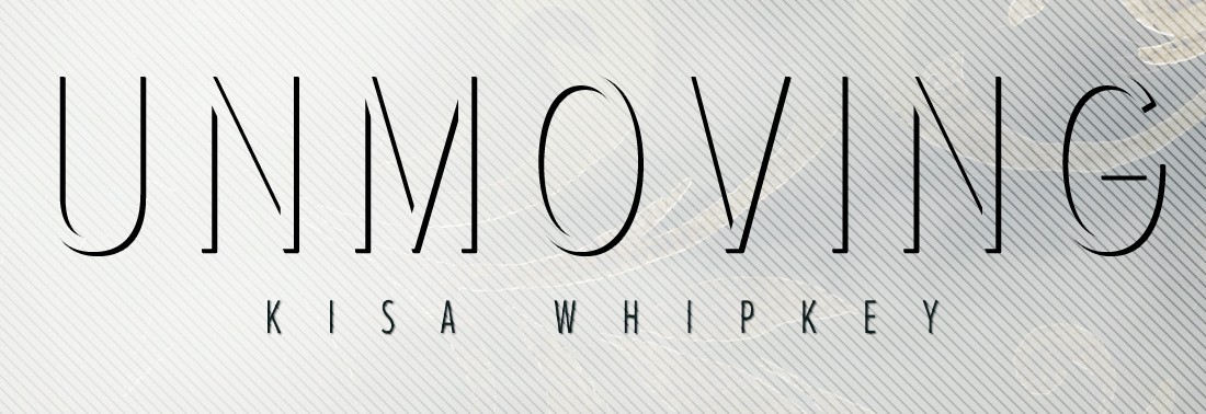
And if my word that you’ll learn something valuable isn’t enough, how about this to entice you? She’s using my nemesis WIP, Unmoving, as the example cover. That’s right, by the end of the series, Unmoving will have a real life cover! And you get to watch it happen. No, that doesn’t mean I finally managed to finish the darn thing. But I can promise you an exciting (well, it’s exciting for me, and maybe the 3 fans I have) announcement regarding it at the end of the series. 😉
So stick around. I can guarantee you won’t regret it.
Take it away, Ashley!
Chapter 1: Groundwork
By Ashley Ruggirello
It’s common to hear the phrase, “You can’t judge a book by its cover,” although it’s often referring to much more than just a book sitting on a bookshelf. In the aesthetic (and competitive) world of publishing and readership, though, books are judged by their covers. I’d even venture to say you have less than five seconds to wow a potential reader with your cover art– talk about pressure! That’s why you see publishing companies and designers working harder and harder to push the envelope, create something new, and really grab their audience. Cover art is such an important element to your story, and boy is it a daunting task to take on! So I’ve taken it upon myself (as a so called “expert”– thanks Kisa ;)) to step up and pen a Cover Art series. Expect this to be the first chapter (of many) breaking down the process– start-to-finish– in creating a print-ready book cover design. And I’ll do my best to post a new chapter every week.
Different from the editorial phase, cover art, unfortunately, requires a certain set of programs to work within, especially if you’re planning on working professionally in the industry. These programs are part of the Adobe Creative Cloud, including Photoshop, Illustrator and InDesign. Now, all three of these are quite expensive to purchase without the prospect of frequent use, but there are online resources I’ve already touched on in a previous blog post: Cover Design On A Budget.
Before we begin the nitty-gritty designing, there are a few key pieces of information needed to set the groundwork. First and foremost, you need a book to design for, preferably one that’s nearing completion. Luckily, we have just that! Throughout this series, we’ll be using Kisa’s WIP, Unmoving, as the guinea pig for our designing adventures. Although this is a good start, we usually need more than just a title to begin. These are the elements I request before beginning any Cover Art project:
The Checklist
- Tagline / Sub-Title
- Full Book Synopsis or the Full Manuscript
- The Author’s Ideal Book Cover Art
- Dimensions of the Printed Book
Tagline / Sub-Title
Although this element isn’t mandatory, I’ll share some examples of popular novels using a tagline to aid in their cover art.

DIVERGENT, by Veronica Roth: “One choice can transform you.”

ACROSS THE UNIVERSE, by Beth Revis: “What does it take to survive aboard a spaceship fueled by lies?”

JESSICA’S GUIDE TO DATING ON THE DARK SIDE, by Beth Fantaskley: “The undead can really screw up your senior year.”
Consider the tagline added real estate to explain your plot (or tease your readers) when designing. In the case of Divergent, the title itself doesn’t explain much. Throw in the tagline “One choice can transform you,” and we’re given a peak inside the story. There’s some sort of conflict surrounding a decision; a decision serious enough to define the decision maker. This immediately adds prospective tension to the plot, in addition to generating interest in learning what decision holds so much weight on the main character’s life and future? And how does it all play out?
Books are judged (and quickly) by their covers, so the more you can explain in a quick glance, the better odds you have of attracting a reader.
The Author’s Ideal
Although not always feasible, the author’s ideal book cover is a great place to start when brainstorming what the cover art should be. If you’re designing for yourself, this part is easy. You know your story best, and how you’d like to represent it. If you’re designing for another author, on the other hand, stop stressing out trying to figure out what’s in the author’s head, and just ask them! Sometimes it may be difficult to put to words, but if your author is able to visualize in their mind’s eye what type of cover they’d classify as ideal, you’re off to a great start. It may be difficult to make that ideal into a reality (e.g. finding the right stock photos could prove to be a challenge), but from this starting point you can begin collaboration and brainstorm how to meld the author’s vision with your creative input and own interpretation of the story.
Always remember: the best design is born out of collaboration. If you’re able to bounce ideas off of more than one individual, including the author, you’ll always come out with a stronger, more powerful design. So always feel free to seek input from friends, family, your team (in my case, the REUTS Acquisitions Team), etc. Trust me, you’ll appreciate the additional eyes, and create a better cover.
Dimensions
This one is tricky to get right off the bat. The standard book size REUTS uses is 5.5″ x 8.5″, however, it can range from 5″ x 7″ to 6″ x 9″, and a few stragglers larger or smaller than those. If you follow the 5.5″ x 8.5″ standard, you know the size to work within for the front and back cover, just not the spine. Unfortunately, it takes a fully type-set book to determine the full cover dimensions. The final number of pages will affect how thick or thin the spin ends up being. (Obviously, this step can be disregarded if you’re focusing solely on an eBook cover design.) Since we’re lacking information at the start of a new project, I usually like to nail down the front cover art, bringing those elements/themes into the back cover, and then add the spine width once it’s determined.
Many times, a printer will provide a design template to work with once the dimensions are finalized. In this case, it’s always safe to initially comp a larger cover size, and edit down, rather than try to increase the size later. Increasing anything that isn’t a vector from its original size in Photoshop will cause distortion and pixilation.
Always remember: Include a bleed in your working cover-art file. It varies between printers, but you can be safe adding .25″ – .5″ around your artwork to account for any cutting idiosyncrasies when the book is in production.
Next week we’ll begin brainstorming for Kisa’s story, Unmoving. Stay tuned!

I’m in the middle of getting my first book published, and the cover design is the most stressful part to me! I’m so excited to read the rest of your series!
Sounds like this was extremely well-timed, then. I hope it helps you!
Congratulations on your forthcoming publication, as well. Cover design is definitely a stressful part of the process, but the final products are so amazing. I’m sure you’ll be so happy when you finally hold a physical copy of your book, graced by the perfect cover. I know I can’t wait to experience that moment someday. 🙂
Thanks for commenting!
I’ve been thinking about a new cover for my book. There are certainly a lot of warnings about doing it yourself, and I don’t think I have the marketing skill set.
My wife is at a librarians’ conference and just told me she attended a seminar that was all about how to judge a book by its cover.
I like the cover you made, but I understand. What would you want it to feature instead?
And that seminar sounds fascinating! I’d love to hear what she learned. Will she be doing a guest post on your blog, or would she consider doing one here, on mine? It could tie in nicely with the series running right now. Have her contact me if she’s interested. 🙂
She sounded interested 🙂 I’ll pass along your email address. I’m not sure what kind of time frame you had in mind.
Fantastic! I’ll keep an eye out for a note from her. 🙂
As for time frame, no big rush. I was thinking it might work well as a tie-in with the current series by Ashley. I’m pretty sure she has at least another couple weeks before she’s done with the Cover Design posts, so after that? But I’m flexible. I can work around Elizabeth’s schedule.
Hi
[…]remarkable blog site and intensely exciting stuff you still have below i definitely learned a lot[…]
[…] Designing a Book Cover: Groundwork | Nightwolf’s Corner […]