Freelance Editing: What You’re Actually Paying For

The following is a guest post by fellow freelance editor Cait Spivey. Cait contacted me after my post on what it takes to be an editor, asking for my input on the topic below. Realizing how important her subject really is, I asked her to come and share it with all of you. So, without further ado, I’ll turn you over to Cait and her fantastic post on what you’re actually paying for when you hire a freelance editor.

Take it away, Cait!


Freelance Editing: What You’re Actually Paying For


By Cait Spivey

 
With self-publishing on the rise, more and more freelance editors are offering their services. Along with this increase, the internet has provided plenty of articles on how to find a good freelance editor, why you need one, why you don’t need one, what to do if things go badly, etc.

In the comments on those articles, there’s almost always someone who asks why freelance editors charge so much. Many editors charge a flat rate per word or page–for example, Bear and Black Dog, my company, charges $6/pg for a single editor working on a full manuscript edit. It can add up quickly, and writers often balk at the $1500+ price tag. (The Editorial Freelancer’s Association has a page detailing average rates for various levels of service, emphasizing that these are a rough guideline.)

That’s fair — it’s quite a bit of money. In having this discussion, though, I’m reminded of graphics that make the round of the internet from time to time with headers like:
 

PHOTOGRAPHERS
What you think you’re paying for v. What you’re actually paying for

 
You’ve seen them. They typically have two columns. The one on the left has one line with the bare minimum of the job (whether photographer, event musician, etc) and the one on the right goes into more detail.

I figured it was about time we went into a little more detail about why freelance editors charge what they charge, so I put my head together with some of my editor friends and came up with this list.
 

What you think you’re paying for:

 
Someone to read your manuscript and provide feedback
 

What you’re actually paying for:


Time spent on the manuscript itself

 
Yes, we do read your manuscript and provide feedback, but it’s not as simple as all that. As Kisa Whipkey, freelancer and Editorial Director at REUTS Publications, said in her post What it Takes to be an Editor: it’s not just about fixing grammar. Nor is it just providing reactions to the story, the way a beta reader does.

An editor’s job is to see the story both as a series of components and as a whole organism. We’re basically mad scientists, optimizing the whole by tinkering with the parts. This requires hours of reading, and re-reading, and absorbing, and experimenting. And it is all on a case-by-case basis. Yes, there are problems we see a lot and we do have skeleton solutions ready — but we fill those in with your characters, your story, your world, your goals.

As my business partner Ash says: “How long did you spend writing your book? How easy do you think it is to take that work apart and improve it?”

Every editing project has its own challenges, and the kind of dedicated, personal attention good editors provide takes time, often quite a lot. It can also be as draining as writing a book. Editing is neither robotic nor formulaic.
 

Time spent on you

 
We know some comments can be hard to hear. Believe me, we are incredibly aware. Most editors are interested in helping writers improve, which means that we spend a lot of time crafting comments that explain why we changed what we did or why we think such and such needs to go. We also strive to give those critiques in a friendly and helpful tone, and balance criticism with praise.

Some editors take a more tough-love approach than others. It’s important to find an editor whose critique style you’re comfortable with, whether you don’t mind harsher comments or whether sarcasm in an edit letter is not your thing at all. Many editors can adapt their tone to your preference if you let them know which end of the spectrum you’re on — doing so is all part of the time spent on you as a valued client.

Editors want to form relationships with their clients, because trust makes it a lot easier to work together on a manuscript. For those clients who are self-publishing, we hope to form the kind of bond that traditionally published authors often experience with their in-house editors, and facilitate a long-term working arrangement.
 

Time and money for undergrad or graduate training

 
Like most professionals these days, we went to college, and like most former college students, we spent — and are still paying back — a lot of money to do it. A lot of people assume college is a given expense these days, but let us not forget that it’s meant to be an investment, and one that will eventually be returned in wages, and then fed back into the economy as spending dollars. That cycle gets broken without a living wage, in any line of work.
 

Time and money spent on books, conferences, and further education

 
But education doesn’t end with academia. Our job is dependent on our knowledge of literary trends and we can’t do our job well if we stick our heads in the same old sand. We buy new books on writing techniques (we write new books on writing techniques), we attend conferences and connect with our colleagues, with agents, with booksellers and with writers. We take classes to expand and hone our skill set.

All that costs money.
 

Time watching the market and identifying trends


Market trends (i.e. what books are selling) are as important as style trends for an editor. If your goal is to self-publish, we need to be aware of where your book sits on the proverbial shelf and what company it’s in. If your goal is traditional publishing, where agents and acquisitions editors look for originality with extreme prejudice, we need to be able to help your book stand out from recent sales and best sellers.

This means subscriptions to Publisher’s Weekly and Publisher’s Marketplace. It also means tons of time devoted to reading new releases. There’s a reason editors tend to specialize in genres or categories. There’s not enough time in the world for us to be well-versed in the market of every genre or category.
 

Business Costs

 
This includes maintaining a website and paid advertising, as well as time spent marketing and networking. It also includes promotional materials, such as the free first five pages critiques my company gives away on Twitter every month. Then there’s the cost of professional memberships with organizations like the Editorial Freelancer’s Association.

On top of all of that: taxes. A substantial amount of freelance revenue goes back in taxes, since we’re responsible for tracking and paying them ourselves as opposed to having an employer handle it.
 

Equipment

 
We often don’t think of computers or software as professional equipment, but for many people, they are. The laptop I’m working on right now is nearly five years old, ancient as far as computers are concerned. If it craps out, I need to be able to go and purchase a replacement immediately, because my job depends on it.

Microsoft Word, used by most writers, is also not free despite its ubiquity.
 

The cost of living

 
My company is still less than a year old, which means that the majority of our fees go straight back into the business account to build our presence and cover those business costs I mentioned. But, eventually it will contribute meaningfully to my household income.

– – – – –

Here’s a break-down for an example job to illustrate how the high payment might be spread across all the factors I’ve just outlined.

Time spent on a manuscript can vary quite a lot depending on many factors, but for simplicity’s sake we’ll use averages. I average about six pages per hour on a manuscript. So if you have a 300 page book, that takes me about fifty hours. If you pay me $1800, that’s about $36 dollars an hour (gross, meaning before taxes).

But: I only spend two, maybe three hours a day sitting down working on a manuscript. The rest of my day is devoted to blog posts, marketing, communication and networking, market research, etc. My wage for those things comes out of the payment I receive for editing. My $70 bucks for two hours of editing is my wage for an eight hour work day (often longer), so it ends up being a lot closer to $9/hr. 

Don’t let the lump sum fool you — for the most part, freelance editors are hardly swimming in profits.

If you’re interested in a freelance editor’s services but can’t afford a full edit, don’t think that’s the end of it! I can only speak for myself and my company on this matter, but Bear and Black Dog is always very happy to work with writers on staggered payment schedules. As freelancers, we are incredibly flexible in this way.

**Note from Kisa: I, too, am willing to work with writers on staggered payment schedules. So never be afraid to ask if the lump sum is more than you can manage. 😉 **

– – – – –

Photo of Freelance Editor Cait Spivey Cait Spivey is an editor with Curiosity Quills Press and managing member of Bear and Black Dog Editing, LLC. As an editor, Cait pulls from her lifelong experience loving books to bring forth the best elements of every story in a way that grabs the reader and doesn’t let go. She wants to help books tug heartstrings. She wants to help books become heirlooms. She wants to help books get quoted on Tumblr. Contact her through her website or her Twitter @CaitSpivey.
What it Takes to be an Editor

Now that I’m becoming more known in the literary community, I’ve had people approach me for advice on how to break into an editing career. They all have this bright-eyed illusion of what being an editor entails, envisioning (as I did) days filled with nothing but reading. Sounds glamorous, doesn’t it? Every book lover’s dream job. But let’s have a candid (and snarky!) discussion about the reality of being an editor. Because that pretty image in your head is nothing like the real thing.

A lot of people falsely believe that writing and editing are parallel careers. They’re not. They’re more like distant cousins than the sibling status everyone thinks. If you enjoy the process of creation, editing is not for you. If you love reading, devouring books like life-saving sustenance, editing is not for you. And if you like entertainment that keeps your brain active and stimulated for hours, editing is not for you. If, however, you love puzzles, methodical routines, and helping others, then maybe you’re fit to be an editor.

The truth is, editing’s hard. It’s monotonous, dull, repetitive, and there is absolutely no glory in it. It’s messy, annoying, and time-consuming. And it uses absolutely none of your creative juices. It’s analytical, more than anything, relying on thought processes normally associated with math and logic, rather than those involved with writing. It requires a completely different skill set, and, contrary to popular belief, good writers do not necessarily make good editors. And vice versa.

The literary world is the only one I know of that doesn’t clearly differentiate between its specialized skills, lumping them into one single category — wordsmith. No one would expect a dentist to be able to perform heart surgery, so why can’t we figure out that editing and writing aren’t the same thing? Yes, they’re both grounded in a love for words. And both do conform to the rules of the English language (most of the time). But that’s pretty much where the similarities stop.

So what does it take to be an editor? Let’s find out.
 

Requirement #1: No Life (Workaholic)

 
You know those nights and weekends, holidays, family and friends? Kiss them all goodbye. If you want to be an editor, you better be a workaholic, because otherwise, you’ll be buried up to your eyeballs before you can blink. And don’t think that’s temporary. Oh no, you will never again have a moment to yourself. Your inbox will be filled to the breaking point every time you log in. Your morning run, every meal you eat, and even long car trips will become reading time. And sleep? Yeah, you’d probably get more of that if you’d popped out that baby your mom’s been nagging you to have.

Every single second of every day from the moment you get your first assignment will be filled with something. And if, God forbid, you take so much as an afternoon off, you’ll spend the next two weeks trying to climb back on top of the mountain.

Editors have one of the highest burn-out rates of any job on the market. If you survive past two years, you’re considered hard-core. Because none of us get to do what everyone somehow assumes we do: sit in our offices, leisurely sipping coffee and reading to our heart’s content. In fact, if we get to read at all during the day, it’s probably at home, or crammed into the fifteen empty minutes between tasks. The majority of an editor’s day actually consists of answering emails, planning out structural edits, line edits, project management, more emails and then more line edits. Reading’s at the bottom of the list, unfortunately.

So if you’re an anti-social, agoraphobic insomniac with a workaholic tendency, editing will be the perfect job for you. The rest of us have to learn how to juggle life and work. And sadly, life almost always loses.
 

Requirement #2: OCD (Detail-Oriented)

 
Editing is highly detail-oriented. It’s slow and tedious, and during the course of a single project, you’ll read each chapter so many times you could nearly recite the thing verbatim by the end. So being slightly OCD helps.

There’s a strange (as in sick) sense of satisfaction to be found in surgically removing and altering the smallest things (things normal humans don’t notice) in a sentence. As an editor, you don’t just gloss over everything, you hone it, until there’s absolutely no better way that statement could be phrased. There’s not an ounce of fluff left in the entire manuscript, and, by George, you made sure that thing sings! How long did it take you to do it? Here’s the kicker: about 6-8 months (that includes the amount of time spent back and forth in revisions with the actual author. Because, you know, editors don’t actually write the books). And how long does it take a reader to read those beautifully honed words? About a week, if you’re lucky. I actually watched someone breeze through a project I’d slaved on for nearly a year in a single afternoon!

The point here is that editors are a strange breed of OCD (ahem, I mean detail-oriented) individuals who hold themselves and their authors to a crazy standard of perfect, and will accept nothing less. If you’re not willing to read a manuscript 52 times, invest upwards of 6 months of your life into someone else’s work, then walk away. You’re not one of us.
 

Requirement #3: Skills (Not Just Grammar, Folks)

 
This should be a no-brainer. Clearly, an editor needs skills, right? But which skills?

There’s an assumption out there that editing consists of one thing — fixing grammar. Editors are all a bunch of pompous English professors who couldn’t sell their own writing, and so, bitterly hand down judgement on everyone’s inability to follow the rules of the English language. In short, we’re grammar Nazis, and that’s it. That assumption is incorrect. And why so many writers get taken advantage of by shoddy editors who do nothing but fix superficial punctuation and spelling mistakes. (**Ducks from the impending barrage of hatred.**)

A real editor does so much more than fix your grammar. They’ll do that too, but more importantly, they’ll fix your story in its entirety. From plot holes, character development, and timeline re-sequencing, to sentence smoothing, and fact/detail cross-referencing, an editor is a master storyteller. Not only do they fully understand the various narrative methods and their uses, but they do all this without compromising the writer’s voice. They’re chameleons, morphing into a version of the author and enhancing that person’s style so that no trace of the editor is visible to the outside world. (I mentioned there was no glory in editing, right? All the applause and accolades go solely to the author — as they should. You don’t exist to the world of readers.)

True editors can hold an entire book in their heads, shifting and reorganizing the narrative threads as needed. And the really good ones can do this with multiple projects at once. It’s a rare skill, and one that will instantly mark a professional from an amateur. This is the thing that the writers-turned-editors can’t compete with. What the grammar Nazis can’t ever hope to provide. This is the true skill of an editor. So the question is, does this sound like you? If yes, then congratulations, you’re an editor. If what I’ve said sounds like mumbo-jumbo or makes you cringe even the tiniest bit, then adios! You’re better off doing something else.
 

Requirement #4: Passion (Passion Trumps the Suckage)

 
This is the last requirement for becoming an editor, but I’d dare say it’s the most important one. Why? Because passion is what makes it all worthwhile; it’s what trumps all the suckage. As you can see, editing is kind of a sucky job. I mean, for some of us, it’s a calling, and we love it through and through. But to the outside world, it looks brutal, horrible, and leaves you wondering why, in God’s name, anyone would ever want to do it. The answer is pretty simple though: passion. Passion for storytelling, for books, and for the people who write them. If you don’t have this, you’ll never make it as an editor. You might survive for a little while. You may even enjoy it at first. But eventually, the incessant schedule will wear you down and you’ll walk away.

How do you know if you have it? The passion? I’m not sure. I don’t think there’s a quantifiable way to tell. But I’ll leave you with this to ponder:

Writers often talk about how writing is the best part of their day. How it’s a cathartic release, a joy. For them, the creation process is the most beautiful thing. But for an editor, a 100% born-to-be editor, it’s not. That joy will come from the part of the process every writer loathes. Where writers find relaxation pouring words onto a page, you’ll find it in rearranging those words. Where they find joy breathing life into new stories, you’ll find it in fixing them. To you, the best part will be feeling all those intricate puzzle pieces click into place, and then watching, like a proud teacher, as your author and their book graduate to take their place in the world of success.

It’s not a job for everyone, but if you have the skills and the passion, (if you can’t imagine yourself doing anything else,) then it just might be for you. I’m definitely 100% editor. Are you?

How to Judge a Book by Its Cover

After spending the past several weeks learning the ins and outs of cover design, I found myself thinking more about the other side of the fence — the buyer’s side. I tend to browse bookstores rather aimlessly, as I’m sure a lot of us do, waiting for something to pop out and grab me. We’ve always been told, “Don’t judge a book by its cover.” But that’s exactly what we do. We can’t help it; it’s instinct, a way to filter the walls and walls of choices and prevent information overload. What actually makes a cover design stand out against the others, though? What hidden information are we subconsciously told in a glance? We saw glimpses of it during Ashley Ruggirello’s excellent series, but I wanted an opinion from outside the design world, from someone whose job isn’t necessarily to create the covers, but to judge them.

So I recruited Elizabeth Watson. Some of you may recognize that last name from a post I wrote back in May announcing the release of A Foundation in Wisdom, and you’d be correct. Elizabeth is Robert’s wife. But more importantly, she’s a librarian. She faces the same predicament we do when stepping into a bookstore, just on a much larger (professional) scale. So stick around, listen to her tips for deciphering the subtle language of book covers, and then be sure to check out A Foundation in Wisdom!
 

How to Judge a Book by Its Cover


By Elizabeth Watson

 
As Kisa mentioned, I’m a librarian for a small, rural library. My job duties include purchasing books (monthly) for the library and recommending titles to our patrons. As a librarian, I feel it’s important to know your community and what they like/want to read. But obviously, I don’t have time to read every book out there, and there are some genres that appeal to me more than others. So how can I tell whether or not to buy or recommend a title? By looking at its cover. Publishers put a lot of time and money into the cover design, so take advantage of it.

Here are some things I tend to look at while making my decisions:
 

The Title and Cover Art:

 
The cover will let you know the genre. For example:
 
The Sum of All Kisses by Julia Quinn
 
You can tell this is a romance. (And, by the way, a good rule of thumb is: the more skin showing on the cover, the more sex scenes you’ll find inside.)

Whereas this:
 

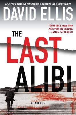
The Last Alibi by David Ellis

 
…clearly isn’t. Based on the endorsement from James Patterson and the imagery, it’s safe to say The Last Alibi is a suspense novel.

The cover can also give you a hint about location. For example:
 

Discretion by Allison Leotta
 
If you recognize the building on the cover of Discretion, you can tell it takes place in Washington, D.C.
 
The Bone Bed by Patricia Cornwell
 
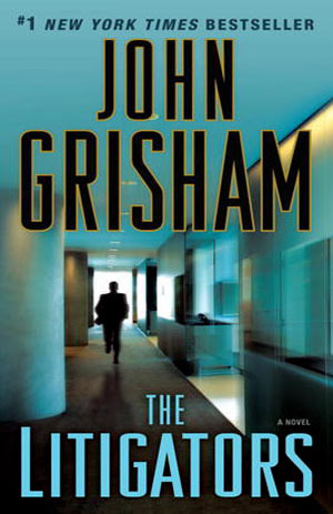
The Litigators by John Grisham
 
Also, pay attention to the presentation of the author’s name; the more real estate it takes up, the more likely you are to be looking at a famous, established author (as illustrated above).
 

Author Recommendations:

 
Getting endorsements from established writers can really help sell your book.  If the book you’re looking at has author recommendations and you’re familiar with that author, you can probably safely say the book in your hand will be similar to those written by the endorser. For example:
 
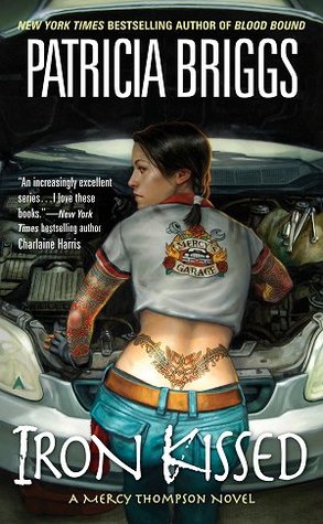
Iron Kissed by Patricia Briggs
 
Charlaine Harris writes paranormal romance, so you can guess that Iron Kissed is probably a paranormal romance, too.  (I would say it’s also safe to guess that the main character isn’t very quiet and conservative based on the tattoo.)  But if you don’t have a famous author to provide you with a quote, quotes from reviewers are helpful, too.  I just recommend making sure the quote tells the reader or purchaser what to expect from the book — should they expect a lot of action? Courtroom drama? Vampires? Fantasy?
 

Awards or Prizes:

 
The Replacement Child by Christine Barber
 
As a reader/purchaser, I definitely pay attention if a book has received a prize. A few examples of awards given to authors are the Edgar award for mysteries, the Christy award for Christian fiction, and the RITA award for romances. Being nominated is impressive even if you didn’t win, so you should brag up your nomination on the cover, too.
 

Additional Things that Factor into Purchasing:


  • Patron requests — if one of our patrons asks for it, I try to buy it.
  • Variety and diversity — I try to get something for everybody, something to represent all the genres. And, of course, I try to buy the big-name, bestselling authors when they come out with a new book.
  • Local authors.
  • Reviews — the Library Journal, Kirkus Reviews, newspapers, and other print sources are helpful. I also look at online reviews at Goodreads, Amazon, and Fantastic Fiction, as well as BookPage, and BookReporter. And I buy the Oprah’s Book Club selections and books that get reviewed in O: The Oprah Magazine.
  • If we have some books in a series, I will try to complete it.
  • Impressive covers with good reviews or endorsements from famous authors.
  • Local Book Club Requests — book clubs often tell me what title they’re planning to read next, and I’ll buy copies of their selection for the library.

Well, those are my thoughts. I hope you find them interesting and useful. The world of cover design is an intricate thing from start to finish. A lot goes into the design side, but nearly as much goes into the decision to buy. If you keep some of these key elements in mind while you create, I’m sure you’ll be able to wow the world with your covers.

Designing a Book Cover: Conclusion

Welcome to the 7th and final installment of Ashley Ruggirello’s guest post series on cover design.

For those just joining us, meet Ashley, Creative Director/Founder of REUTS Publications, and owner of freelance design company, Cardboard Monet. She’s been sharing her design expertise, taking us through the process behind designing a book cover. From inception to finished product, she’s illustrated the collaborative steps authors and designers go through, using my nemesis WIP as the guinea pig. And today, we’ve reached the end.

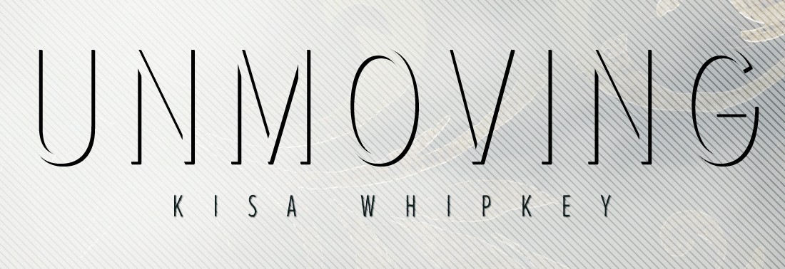
Know what that means? That’s right, next week I’ll be revealing the announcement I’ve been teasing you with since the beginning. I’m pretty excited about it, and hope you will be too. So follow along as Ashley walks you through the finishing touches on Unmoving‘s design and get ready for next week’s surprise! 😉
 

Chapter 7: Unmoving Tutorial Finale


By Ashley Ruggirello

 
The end is near. We’ve entered the closing chapter of our Book Cover Art Series! We started the series with an idea, something abstract and intangible. After playing around with that idea, and different forms of representation, the final cover was revealed. And, if you’re interested in how the cover was created, Chapter 5 and Chapter 6 have documented that process. But now, the time has come to put the finishing touches on the Unmoving cover, and close the book on the wonderful journey we’ve taken together.

Last, but not least . . . the necklace.

Picking up from last week:
 
Screen Shot 2013-10-28 at 7.17.54 PM
 

And again, the basic design elements


Part III: Step-By-Step Tutorial for the Unmoving Book Cover

 
Open the Necklace inspiration image in a new browser tab. You don’t need to pull it into Photoshop, just have it easily accessible to reference. In a new layer, above all the background/bench layers, zoom in and draw with the brush tool (“B” on your keyboard to bring it up). It doesn’t matter what color you use, but remember to keep the brush sharp:
 
Screen Shot 2013-11-04 at 7.31.17 PM
 
Before I show how it looks on my screen, we’ll have to add some FX to the necklace base. Remember the button? Make sure you have the necklace layer selected, and from the toolbar at the bottom of your layer window, click the FX icon and select “Drop Shadow”: (We’ll start with Drop Shadow, but we’ll be adding a couple different effects in one swoop.)
 
Screen Shot 2013-10-28 at 6.40.00 PM
 
Screen Shot 2013-10-28 at 7.09.34 PM
 
This’ll open the effects window, where you can change the Distance to “3″, Spread to “0″, Size to “38″ and Angle to “150″:
 
Screen Shot 2013-11-04 at 7.35.01 PM
 
Then, from the left-hand column, click “Outer Glow” (as you see from the above screen shot). You’ll change these options to Blend Mode of “Hard Light”, Opacity of “100%”, Spread to “29%”, Size to “90px”, Range to “50%” and Color to “#c0c9cc” :
 
Screen Shot 2013-11-04 at 7.36.02 PM
 
Then hit OK. And, while keeping that layer selected, set it to Multiply, Opacity “48%” and Fill “0%”:
 
Screen Shot 2013-11-04 at 7.37.35 PM
 
It should look something like this (zoomed in):
 
Screen Shot 2013-11-04 at 7.39.05 PM
 
Duplicate the layer by either clicking CTRL/command + J or right-clicking the layer and selecting Duplicate Layer:
 
Screen Shot 2013-10-28 at 6.36.22 PM
 
On your new layer, open up the FX window again. You’ll notice the previous effects have already been applied to this duplicate layer:
 
Screen Shot 2013-10-28 at 6.40.00 PM
 
Screen Shot 2013-10-28 at 7.09.34 PM
 
We’ll be adding a Gradient Overlay, so select that option from the left side bar. Set Blend Mode to “Mulitply”, Opacity to “100%”, Style to “Linear”, and Angle to “90”:
 
Screen Shot 2013-11-04 at 7.42.26 PM
 
The gradient colors themselves look like this:
 
Screen Shot 2013-11-04 at 7.44.01 PM
 
From left to right the colors are “#262626”, “#575757”, “#8a8a8a” and “#262626”. Hit OK and OK, then look back at your layer. Make sure you change your layer Opacity to “87%” and you should see something like this:
 
Screen Shot 2013-11-04 at 7.47.59 PM
 
Screen Shot 2013-11-04 at 7.45.33 PM
 
In a new layer below the necklace, using a soft-edged brush with a black color (#000000), add a slight drop shadow to the bottom edge of the necklace:
 
Screen Shot 2013-11-04 at 7.50.46 PM
 
Screen Shot 2013-11-04 at 7.49.46 PM
 
I want to apologize for this next step, which I forgot to document: the gem image and coloring. For this, you can either play around and come up with your own gem, or use the following image (taken directly from my design file) and add it as a new layer below your necklace, but above the drop shadow layer:
 
shine
 
With the gem in place, you should have something that looks like this:
 
Screen Shot 2013-11-04 at 7.54.28 PM
 
Zooming back out, the last thing we need to add is the chain. Zooming out allows you to better see how it’ll fall off the bench in relation to the design as a whole. This step was as simple as using the brush tool with a hard brush to draw out a chain:
 
Screen Shot 2013-11-04 at 7.57.57 PM
 
To add a little bit of realism, we’ll add a Gradient Overlay to the layer, so open the FX and select Gradient Overlay:
 
Screen Shot 2013-10-28 at 6.40.00 PM
 
Screen Shot 2013-11-04 at 7.59.32 PM
 
Set your options to Blend Mode at “Normal”, Opacity at “100%”, Style to “Linear” and Angle to “90%”:
 
Screen Shot 2013-11-04 at 7.59.55 PM
 
With the gradient colors from left to right at “#262626”, “#575757”, “#000000” and “#262626”.
 
Screen Shot 2013-11-04 at 8.01.44 PM
 
Hit OK and OK one final time, and you’re done! Take a moment to bask in your new cover, and the new techniques, tips and tricks you’ve learned.
 
Screen Shot 2013-11-04 at 7.19.12 PM
 
Thank you for participating and following our Book Cover Art Series! REUTS would love to showcase the work you come up with based on our series, so email them to hello@reuts.com, and we’ll display them on our blog! Happy designing, reading and writing!

Designing a Book Cover: Tutorial Part 2

Welcome to week 6 of Ashley Ruggirello’s guest post series and part 2 of her guided walk-through.

For those just joining us, meet Ashley, Creative Director/Founder of REUTS Publications, and owner of freelance design company, Cardboard Monet. Over the past weeks, she’s been sharing her design expertise, taking us through the process behind designing a book cover. From inception to finished product, she’s illustrated the collaborative steps authors and designers go through, using my nemesis WIP as the guinea pig. But it’s not over yet!

Last week, she began a step-by-step breakdown of how she created this beautifully subtle piece of art. Today is part 2, and there’s one more installment scheduled for next week. That means, in two week’s time, I’ll finally reveal the exciting announcement I’ve been hiding. So stick around, learn some of Ashley’s tricks and find out what I’m keeping up my sleeve. We’re almost there, I promise! ;)
 

Chapter 6: Unmoving Tutorial Continued


By Ashley Ruggirello

 
If you’re just now joining us on this cover designing adventure, I’d suggest picking up from Chapter 5, where we begin the tutorial, or Chapter 1, to see how far we’ve come. Last week we ended with a good base image of a color-adjusted and textured bench:
 
Screen Shot 2013-10-21 at 9.06.52 PM
 

And again, the basic design elements


Part II: Step-By-Step Tutorial for the Unmoving Book Cover

 
Bring in the filigree
 
To start, we’re going to jump right in to the floral filigree, which is — by far — the more difficult part. Bring the floral filigree into your Photoshop document by your preferred method (c+p, drag/drop, etc…) as a new layer, above the work we’ve already done. You’ll want to Transform (CTRL/Command +T) and rotate the image -5.77 degrees to the left, to get it in a similar location as the final. Of course, you can also omit this step.
 
Screen Shot 2013-10-28 at 6.28.41 PM
 
Set the layer to Lighten and you’ll see a very gray silhouette of the filigree:
 
Screen Shot 2013-10-28 at 6.29.54 PM
 
Screen Shot 2013-10-28 at 6.56.23 PM
 
To get that gold color, we need to mess with the image Hue & Saturation by going to Image > Adjustment > Hue and Saturation:
 
Screen Shot 2013-10-28 at 6.31.16 PM
 
Click the Colorize option. This is where a lot of playing around, and guess/check comes into play. If you select Preview you can see your progress before committing to anything. I set Hue to “45”, Saturation to “24” and Lightness to “+15”.
 
Screen Shot 2013-10-28 at 6.32.11 PM
 
It’ll give you that gold color on just the filigree element.
 
Screen Shot 2013-10-28 at 6.54.21 PM
 
But the filigree in the sky is too light, so duplicate the layer by either clicking CTRL/command + J or right-clicking the layer and selecting Duplicate Layer:
 
Screen Shot 2013-10-28 at 6.36.22 PM
 
Set this layer to “49%” Opacity:
 
Screen Shot 2013-10-28 at 6.53.47 PM
 
There, that’s a little better! But now we have all that crap over the bench that we definitely don’t need. Here’s another section that’s guess-and-check. Take those two filigree layers and put them in a group of their own by highlighting them both and hitting CTRL/Command + G or right-clicking and clicking the folder icon at the bottom of your layer window:
 
Screen Shot 2013-10-28 at 6.40.00 PM
 
Your two filigree layers should now be in their own group, easy to edit at the same time, which is what we’re about to do! Using that same icon bar above, hit the icon with the circle in the square to create a mask.
 
Screen Shot 2013-10-28 at 6.41.57 PM
 
This adds a white box next to your group, which — in essence — allows us to erase any element within the group without truly editing the image itself. That way, if we ever need to go back and make changes, we don’t lose the authenticity of the original:
 
Screen Shot 2013-10-28 at 6.42.34 PM

(Disregard that mine says “Group 9”, yours will likely say “Group 1”)


Now, make sure you’re selecting the mask (it should have a the frame around the corners when selected as seen above), and select the Eraser tool. You can hit “E” on your keyboard to pull it up, or find the eraser icon in your left toolbar:


Screen Shot 2013-10-28 at 6.45.17 PM


From the color selection at the bottom of your toolbar, make sure the foreground color is set to white:


Screen Shot 2013-10-28 at 6.46.14 PM


We’re moving all around your screen now. Looking at the top toolbar, select the brush size and shape. Make sure it’s set to a fuzzy circle, at any given size (mine is 300px):


Screen Shot 2013-10-28 at 6.47.17 PM


Screen Shot 2013-10-28 at 6.48.23 PM

 
Working back on your art board, begin to “erase” the filigree overlapping the bench and surrounding area. You’ll notice your mask on the group layer turn black where you’ve erased:
 
Screen Shot 2013-10-28 at 6.50.11 PM
 
Screen Shot 2013-10-28 at 6.52.59 PM
 
I can’t say exactly how I erased, but you can see my mask on the guide layer as a general idea. The lighter grays were created by changing the opacity of my eraser, so I wasn’t deleting as much.

And there you have it! The filigree has been added to your design.
 
Typesetting title, author name, and tagline
 
(Even though I consider this the easiest part of the design, Kisa and I still went through multiple combinations and options before settling on the final._

Let’s start with the tagline…

The fonts used were “Gotham – Light” and “Gotham – Bold”, for the unbolded and bolded words, respectively, at a size of 9pt. (Here’s where you can sub for Century Gothic.) All you really have to do is type out:

“Everyone has a limited supply of good karma. What happens when it’s gone?”

Break the line between the sentences, center it nicely in the sky, and you’re all set with the tagline:
 
Screen Shot 2013-10-28 at 7.01.31 PM
 
Next, the title. The title is “Proxima Nova Alt Condensed – Light” at font size “64pt”. You can also sub “Collaborate – Thin“. Type out “Unmoving” in all UPPERCASE (the font color doesn’t matter at this point) and place it evenly between the tagline and the top of the bench:
 
Screen Shot 2013-10-28 at 7.05.20 PM
 
Back in your layers window, change the fill to “0%”
 
Screen Shot 2013-10-28 at 7.06.13 PM
 
You’ll notice the font has disappeared, but that’s okay! That’s what we want. Make sure you have the text layer selected, and from the layer toolbar at the bottom of your window, click the FX icon and select “Drop Shadow”:
 
Screen Shot 2013-10-28 at 6.40.00 PM
 
Screen Shot 2013-10-28 at 7.09.34 PMThis will open the Effects window, where you can change the Distance to “5”, Spread to “89”, Size to “1” and Angle to “150”:
 
Screen Shot 2013-10-28 at 7.10.57 PM You’ll now see a really cool, shadowed text:
 
Screen Shot 2013-10-28 at 7.12.09 PM
 
And, boom. The title. 🙂

The last piece of text is Kisa’s name. It’s also in  “Proxima Nova Alt Condensed – Light” at size “14pt”. (You can sub “Collaborate – Thin“.) Type out “Kisa Whipkey” in all UPPERCASE, and place it right below the title, centered on the art board.
 
Screen Shot 2013-10-28 at 7.15.42 PM
 
Similar to the title, open the Drop Shadow Effects window, and set the Blend Mode to “Normal”, Opacity to “75”, Angle at “150”, Distance to “1”, Spread to “0” and Size to “1”:
 
Screen Shot 2013-10-28 at 7.16.37 PM
 
After hitting “OK”, all the text in the design is complete!
 
Screen Shot 2013-10-28 at 7.17.54 PM
 
Last, but certainly not least, we’ll address the necklace sitting on the bench, and finish off the Book Cover Art Series! I hope you’ve enjoyed (and found useful) this step-by-step tutorial. As always, if you have any questions, please don’t hesitate to ask. That’s what I’m here for!