Welcome to week 4 of Ashley Ruggirello’s guest post series. For those of you who’ve been following along, feel free to jump down to the chapter header. You know the drill by now.
For those just joining us, I’ve teamed up with Ashley, Creative Director and Founder of REUTS Publications, to bring you a series about cover design. (And by “teamed up”, I really mean asked permission to syndicate her work. ![]() ) I know nothing about cover design, so why not defer to an expert like Ashley? Because that’s what she is. Not only is she the creative genius behind all of REUTS, she’s also the owner of freelance design company, Cardboard Monet. I’ve had the privilege of watching her talent in action, so I’m extremely thrilled that one of her brilliant designs will be featured on my work.
) I know nothing about cover design, so why not defer to an expert like Ashley? Because that’s what she is. Not only is she the creative genius behind all of REUTS, she’s also the owner of freelance design company, Cardboard Monet. I’ve had the privilege of watching her talent in action, so I’m extremely thrilled that one of her brilliant designs will be featured on my work.
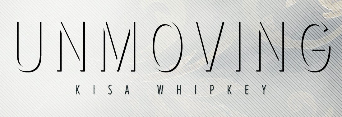
That’s right, not only will she being giving you inspired insight into the design process, she’s using my nemesis WIP, Unmoving, as the example cover. No, that doesn’t mean I finally managed to finish the darn thing. But after this, I’m certainly feeling inspired to! So stick around. At the end of the series, I’ll reveal the big announcement I’ve had up my sleeve. If you’re a fan of my work, you definitely won’t want to miss it!
Alright, take it away, Ashley!
Chapter 4: More Mocking
By Ashley Ruggirello
This week’s post is exciting for me as a designer, because I’m able to show you in a side-by-side view how we use feedback to transform a design. As promised, I’m going to recap Kisa’s thoughts on the original cover mock-ups from Chapter 3, and then give you a chance to catch the subtle, and not so subtle, updates in the new versions. The mock-up and revise process can consist of many rounds, but for the sake of this series, we’re only going to show one. Kisa and I went through a couple more after this point to get to the final design, but those will stay behind-the-scenes. Next week, we’ll debut that final, and jump right into a step-by-step tutorial on how the cover was created. We’ll provide all the stock and styles so you can practice and create the Unmoving cover yourself. Follow along, and we’ll have some fun! 🙂
Mock-Up #1
Feedback points from Kisa:
- Can the necklace be more prevalent, maybe with a chain interacting with the text?
- Add the filigree from mock-up #2 to mock-up #1, faintly in the corners
- Increase the title, and move it up more.
Overall, Kisa’s feedback regarding mock-up #1 was very positive. I think there was even an “I love this!!!” somewhere in the email, which is great! But, it also makes it more difficult for the second mock-up. I made somewhat of a mistake sending Kisa this first, while working on the second. It allowed her to focus on the design in front of her, develop a love (or hate) relationship with it, and then hold the second to a higher standard. I would recommend sending all mock-ups at the same time, to give a fair comparison of both against one another. Fortunately for me, Kisa has an artistic background, and didn’t let the appeal of mock-up #1 get too much in the way of discussing mock-up #2 😉
Back to the covers…
The contemporary, faint feel of this cover would stand on its own on a bookshelf, and captured many of the main elements of Unmoving, so overall, she was pleased with the direction. I took her feedback and requests, and got to work. To the left is the original, to the right is the updated mock-up #1 (let’s call it mock-up #1.2):

Note: I began to play with the font, but didn’t complete this round of revisions. The same with the chain – since these are just rough mock-ups, I didn’t take the time to shade/accentuate a 3D effect on the chain.
Mock-Up #2
Feedback points from Kisa:
- Portland is very lush (constant rain) so the dirt below the bench feels out of place.
- Try something more along the lines of a gray palette similar to the first mock-up.
- Apply the same styles but with an image we’ve referenced before, in Chapter 2.
As I expected, after sending mock-up #1 first, mock-up #2 wasn’t received with as much excitement. Kisa had a little more of a clear direction to take this design, though, which is always helpful on my end. Overall, Kisa liked the styles of mock-up #2, but with mock-up #2.2 she wanted to try a new, lighter image.

Quite a change, isn’t it? But you can still see how these two designs fall within the same vein: a more prominent bench, a fantastical overlay texture, movement bringing your eye around the design, etc… I’m actually much more pleased with round two of this mock-up, than the first – proof that a design continues to get better and better with collaboration, edits and multiple rounds of reviewing.
We’ll unveil the direction Kisa picked (and together, we finalized) in next week’s post. If you have any questions, please don’t hesitate to leave them in the comments below, or Tweet us: @REUTSpub. I have a favorite, and I have a feeling I know which one Kisa favors, but let us know what you would do, and which you’d pick if you were in her shoes. Maybe you can sway her opinion 🙂
Remember, next week we’ll get into the cover’s creation, meaning over the course of two or three posts, I’ll walk you through the step-by-step process of recreating this cover. You can practice and practice the techniques I’ve used, and maybe apply them to your own cover in the future. It’ll all begin with the Stock Permission Request mentioned way back when, and how to deal with copyrighted stock.
Until then, have a fantastic week, everyone!


